pacman::p_load(sf, sfdep, tmap,
tidyverse, knitr, patchwork,
leaflet, scales)
# - Creates a package list containing the necessary R packages
# - Checks if the R packages in the package list have been installed
# - If not installed, will install the missing packages & launch into R environment.Take-home Exercise 1: Geospatial Analytics for Public Good
1 Overview
1.1 Background
As urban infrastructures, including public transportation systems like buses, taxis, mass rapid transit, public utilities, and roads, become increasingly digitised, the data generated becomes a valuable resource for tracking the movements of people and vehicles over space and time. This transformation has been facilitated by pervasive computing technologies such as Global Positioning System (GPS) and Radio Frequency Identification (RFID) tags on vehicles. An example of this is the collection of data on bus routes and ridership, amassed from the use of smart cards and GPS devices available on public buses.
The data collected from these sources is likely to contain valuable patterns that offer insights into various aspects of human movement and behavior within a city. Analyzing and comparing these patterns can provide a deeper understanding of urban mobility. Such insights can be instrumental in improving urban management and can also serve as valuable information for both public and private sector stakeholders involved in urban transportation services. This information can aid them in making informed decisions and gaining a competitive edge in their respective domains.
1.2 Objectives
The objective of this study is to utilize appropriate Local Indicators of Spatial Association (LISA) techniques to reveal spatial mobility patterns among public bus passengers in Singapore.
This will include the following tasks:
- Geovisualisation and Analysis:
- Compute the passenger trips generated by origin at the hexagon level
- Display the geographical distribution of the passenger trips
- Explore spatial patterns revealed by the geovisualisation
| Peak hour period | Bus tap on time |
|---|---|
| Weekday morning peak | 6am to 9am |
| Weekday afternoon peak | 5pm to 8pm |
| Weekend/holiday morning peak | 11am to 2pm |
| Weekend/holiday evening peak | 4pm to 7pm |
- Local Indicators of Spatial Association (LISA) Analysis
- Compute LISA of the passenger trips generate by origin
- Display and draw statistical conclusions of LISA maps
2 Loading Packages
The following packages will be used for this exercise:
| Package | Description |
|---|---|
| sf | For importing, managing, and handling geospatial data |
| sfdep | Used to compute spatial weights, global and local spatial autocorrelation statistics |
| tmap | For thematic mapping |
| tidyverse | For non-spatial data wrangling |
| knitr | For dynamic report generation |
| patchwork | For plot manipulation |
| leaflet | For interactive maps |
| scales | For scaling graphs |
The code chunk below, using p_load function of the pacman package, ensures that packages required are installed and loaded in R.
3 Data Preparation
3.1 The Data
The following data are used for this study:
- Aspatial:
- Passenger Volume by Origin Destination Bus Stops for August 2023, downloaded from LTA DataMall using API.
- Geospatial
- Bus Stop Location from LTA DataMall. It provides information about all the bus stops currently being serviced by buses, including the bus stop code (identifier) and location coordinates.
- hexagon, a hexagon layer of 250m to replace the relative coarse and irregular Master Plan 2019 Planning Sub-zone GIS data set of URA.
3.2 Import & Preparation
3.2.1 Aspatial
3.2.1.1 Import into R
We will be importing the Passenger Volume by Origin Destination Bus Stops dataset for August 2023, downloaded from LTA DataMall by using read_csv() or readr package.
odbus08 <- read_csv("data/aspatial/origin_destination_bus_202308.csv")3.2.1.2 Data Exploration
(a) Attributes
glimpse() of the dplyr package allows us to see all columns and their data type in the data frame.
glimpse(odbus08)Rows: 5,709,512
Columns: 7
$ YEAR_MONTH <chr> "2023-08", "2023-08", "2023-08", "2023-08", "2023-…
$ DAY_TYPE <chr> "WEEKDAY", "WEEKENDS/HOLIDAY", "WEEKENDS/HOLIDAY",…
$ TIME_PER_HOUR <dbl> 16, 16, 14, 14, 17, 17, 17, 17, 7, 17, 14, 10, 10,…
$ PT_TYPE <chr> "BUS", "BUS", "BUS", "BUS", "BUS", "BUS", "BUS", "…
$ ORIGIN_PT_CODE <chr> "04168", "04168", "80119", "80119", "44069", "4406…
$ DESTINATION_PT_CODE <chr> "10051", "10051", "90079", "90079", "17229", "1722…
$ TOTAL_TRIPS <dbl> 7, 2, 3, 10, 5, 4, 3, 22, 3, 3, 7, 1, 3, 1, 3, 1, …Insights:
- There are 7 variables in the odbus08 tibble data, they are:
- YEAR_MONTH: Month in which data is collected
- DAY_TYPE: Weekdays or weekends/holidays
- TIME_PER_HOUR: Hour which the passenger trip is based on, in intervals from 0 to 23 hours
- PT_TYPE: Type of public transport, i.e. bus
- ORIGIN_PT_CODE: Origin bus stop ID
- DESTINATION_PT_CODE: Destination bus stop ID
- TOTAL_TRIPS: Number of trips
- We also note that values in ORIGIN_PT_CODE and DESTINATON_PT_CODE are in numeric data type. These should be in factor data type for further processing and georeferencing.
(b) Unique Bus Stops
n_distinct() of the dplyr package allows us to count the unique originating bus stops in the data set.
n_distinct(odbus08$ORIGIN_PT_CODE)[1] 5067The results reveal that there are 5067 distinct origin bus stops based on August 2023 passenger data.
3.2.1.3 Data Wrangling
(a) Convert Data Type
as.factor() can be used to convert the variables ORIGIN_PT_CODE and DESTINATON_PT_CODE from numeric to categorical data type. We use glimpse() again to check the results.
odbus08$ORIGIN_PT_CODE <- as.factor(odbus08$ORIGIN_PT_CODE)
odbus08$DESTINATION_PT_CODE <- as.factor(odbus08$DESTINATION_PT_CODE)
glimpse(odbus08)Rows: 5,709,512
Columns: 7
$ YEAR_MONTH <chr> "2023-08", "2023-08", "2023-08", "2023-08", "2023-…
$ DAY_TYPE <chr> "WEEKDAY", "WEEKENDS/HOLIDAY", "WEEKENDS/HOLIDAY",…
$ TIME_PER_HOUR <dbl> 16, 16, 14, 14, 17, 17, 17, 17, 7, 17, 14, 10, 10,…
$ PT_TYPE <chr> "BUS", "BUS", "BUS", "BUS", "BUS", "BUS", "BUS", "…
$ ORIGIN_PT_CODE <fct> 04168, 04168, 80119, 80119, 44069, 44069, 20281, 2…
$ DESTINATION_PT_CODE <fct> 10051, 10051, 90079, 90079, 17229, 17229, 20141, 2…
$ TOTAL_TRIPS <dbl> 7, 2, 3, 10, 5, 4, 3, 22, 3, 3, 7, 1, 3, 1, 3, 1, …Note that both of them are in factor data type now.
(b) Duplicates Check
Before moving on to the next step, it is a good practice for us to check for duplicated records to prevent double counting of passenger trips.
The code chunk below identifies all rows in the odbus08 dataframe that have an exact duplicate (i.e., another row with the same values in all columns) using group_by_all().
duplicate <- odbus08 %>%
group_by_all() %>%
filter(n()>1) %>%
ungroup()
duplicate# A tibble: 0 × 7
# ℹ 7 variables: YEAR_MONTH <chr>, DAY_TYPE <chr>, TIME_PER_HOUR <dbl>,
# PT_TYPE <chr>, ORIGIN_PT_CODE <fct>, DESTINATION_PT_CODE <fct>,
# TOTAL_TRIPS <dbl>Results confirm that there are no duplicated records found.
(c) Extracting the Study Data
In our study, we would like to know patterns for 4 peak hour periods. Therefore, we can create a new variable period using the ifelse() that states whether an observation occurred during peak period using the code chunk below.
peak <- odbus08 %>%
# Weekday morning peak
mutate(period= ifelse(DAY_TYPE=="WEEKDAY" & (TIME_PER_HOUR >= 6 & TIME_PER_HOUR <= 9), "WDM",
# Weekday afternoon peak
ifelse(DAY_TYPE=="WEEKDAY" & (TIME_PER_HOUR >= 17 & TIME_PER_HOUR <= 20), "WDA",
# Weekend/holiday morning peak
ifelse(DAY_TYPE=="WEEKENDS/HOLIDAY" & (TIME_PER_HOUR >= 11 & TIME_PER_HOUR <= 14), "WEM",
# Weekend/holiday evening peak
ifelse(DAY_TYPE=="WEEKENDS/HOLIDAY" & (TIME_PER_HOUR >= 16 & TIME_PER_HOUR <= 19), "WEE",
# Return off-peak if neither of the peak hour periods
"Off-peak")))))We can then filter for peak-period data using the newly created period column and aggregate the total trips for each origin bus stop during peak period.
peakperiods <- peak %>%
# filter helps to keep records that occurred during period periods
filter(period !="Off-peak") %>%
# aggregate the total passenger trips for each origin bus stop
group_by(period, ORIGIN_PT_CODE) %>%
summarise(TRIPS=sum(TOTAL_TRIPS))Let’s visualise the proportions of passenger volumes for each peak period.
Show the code
freq<- ggplot(data=peakperiods,
aes(x=period,y=TRIPS))+
geom_bar(stat="identity") +
theme(legend.position="none")+
labs(title = "Frequency of Trip for each Peak Period for August 2023",
x = "Peak Period",
y = "Frequency")
freq + scale_y_continuous(labels=label_comma()) + scale_x_discrete(labels=c("WDA"="Weekday Afternoon", "WDM"= "Weekday Morning", "WEE"= "Weekend Evening", "WEM"= "Weekend Morning"))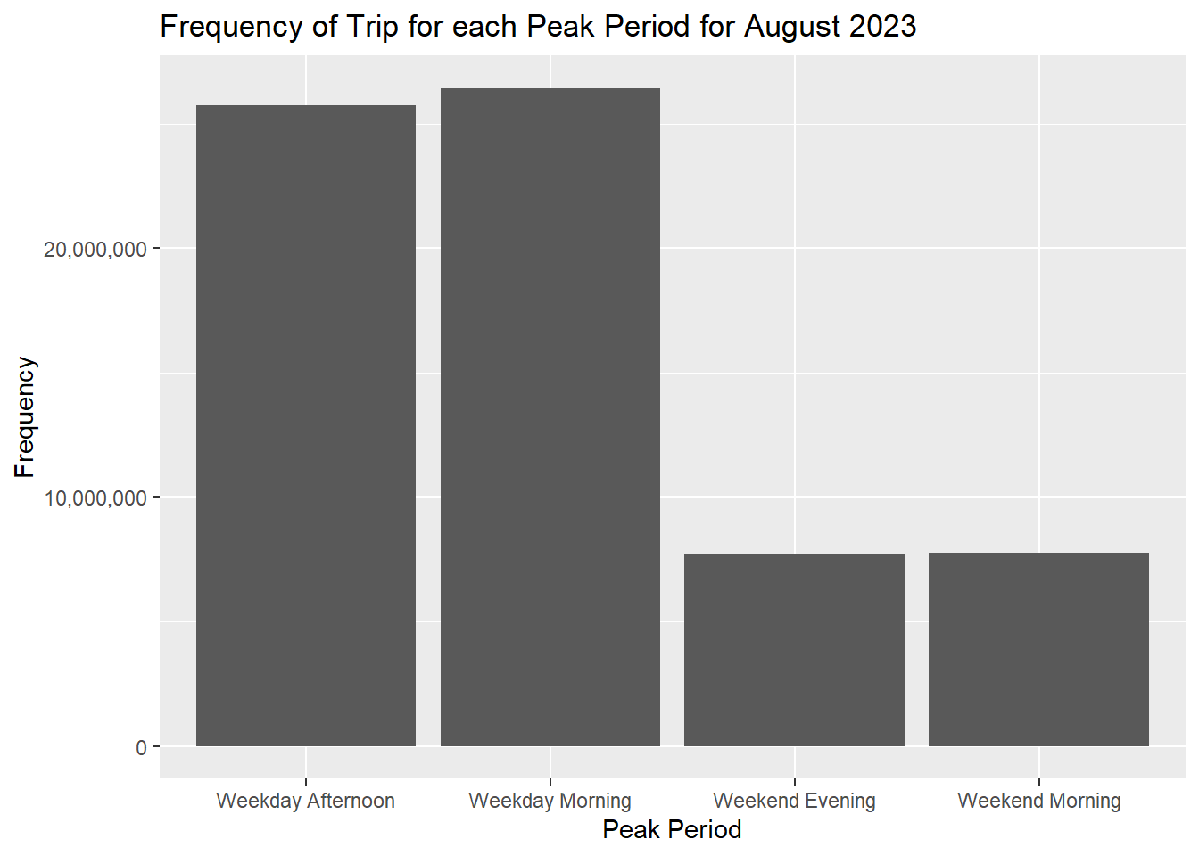
We can see that passenger volume on weekdays are much higher than over the weekends/holidays for the month of August.
Transpose each peak period period as a columns using pivot_wider() of tidyr package will allow us to create further variables at a bus stop level. We replace NA values with 0 to reflect when there are no traffic for certain periods.
peakperiods_wide <- pivot_wider(peakperiods,
names_from = "period",
values_from = "TRIPS")
peakperiods_wide["WDA"][is.na(peakperiods_wide["WDA"])] <- 0
peakperiods_wide["WDM"][is.na(peakperiods_wide["WDM"])] <- 0
peakperiods_wide["WEE"][is.na(peakperiods_wide["WEE"])] <- 0
peakperiods_wide["WEM"][is.na(peakperiods_wide["WEM"])] <- 0Each peak period has its own column, as seen using the glimpse() function of dplyr.
glimpse(peakperiods_wide)Rows: 5,067
Columns: 5
$ ORIGIN_PT_CODE <fct> 01012, 01013, 01019, 01029, 01039, 01059, 01109, 01112,…
$ WDA <dbl> 8448, 7328, 3608, 9317, 12937, 2133, 322, 45010, 27233,…
$ WDM <dbl> 1973, 952, 1789, 2561, 2938, 1651, 161, 8492, 9015, 424…
$ WEE <dbl> 3208, 2796, 1623, 4244, 7403, 1190, 88, 21706, 11927, 6…
$ WEM <dbl> 2273, 1697, 1511, 3272, 5424, 1062, 89, 14964, 8278, 61…3.2.2 Geospatial
3.2.2.1 Import into R
(a) Bus Stop Shapefile
In this section, we import BusStop shapefile into RStudio using st_read() function of sf package. This data provides the locations of all bus stops as at Q2 of 2023. crs = 3414 ensures coordinate reference system (CRS) is 3414, which is the EPSG code for the SVY21 projection used in Singapore.
busstop <- st_read(dsn = "data/geospatial",
layer = "BusStop") %>%
st_transform(crs = 3414)Reading layer `BusStop' from data source
`C:\kytjy\ISSS624\Take-Home_Ex\Take-Home_Ex1\data\geospatial'
using driver `ESRI Shapefile'
Simple feature collection with 5161 features and 3 fields
Geometry type: POINT
Dimension: XY
Bounding box: xmin: 3970.122 ymin: 26482.1 xmax: 48284.56 ymax: 52983.82
Projected CRS: SVY21The imported shape file is simple features object of sf. From the output, we can see that there are 5161 points with 3 fields, and confirm that the datum SVY21 is correct.
Recall that there are 5067 origin bus stops from the peakperiods_wide table, compared to the 5161 bus stops from LTA’s BusStop shape file. This could be due to timing difference – LTA’s BusStop shapefile is as of July 2023, while peakperiod is based on Aug 2023.
qtm() of tmap allows us to quickly map the points to visualise the results.
qtm(busstop)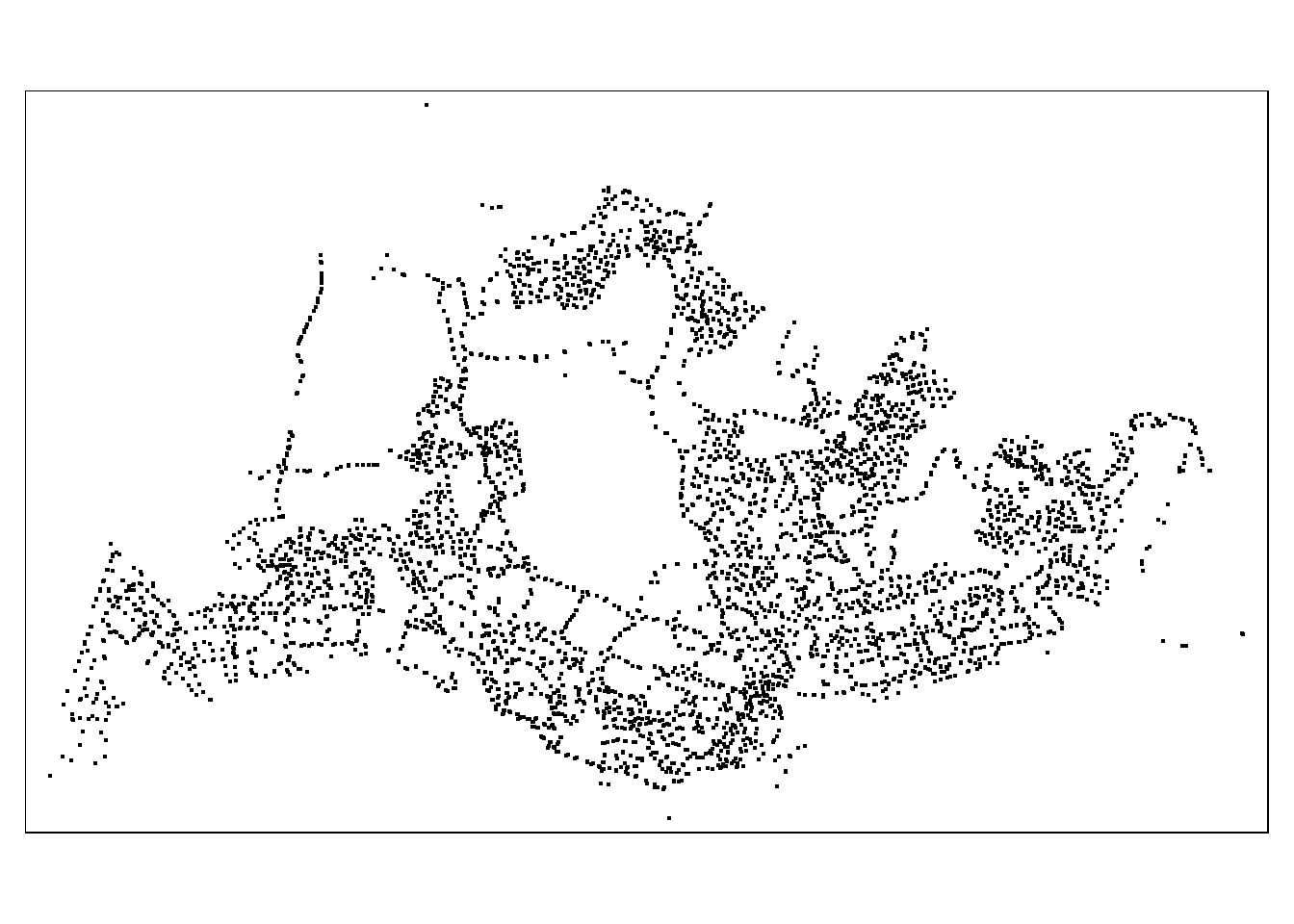
Note that there are 5 bus stops located outside Singapore, they are bus stops 46239, 46609, 47701, 46211, and 46219.
(b) Hexagon Layer
A hexagonal grid is used to replace the relative coarse and irregular Master Plan 2019 Planning Sub-zone GIS data set of URA. Hexagons have a number of advantages over these other shapes:
- The distance between the centroid of a hexagon to all neighboring centroids is the same in all directions.
- The lack of acute angles in a regular hexagon means that no areas of the shape are outliers in any direction.
- All neighboring hexagons have the same spatial relationship with the central hexagon, making spatial querying and joining a more straightforward process.
- Unlike square-based grids, the geometry of hexagons are well-structured to represent curves of geographic features which are rarely perpendicular in shape, such as rivers and roads.
- The “softer” shape of a hexagon compared to a square means it performs better at representing gradual spatial changes.
We first create a hexagonal grid layer of 250m (refers to the perpendicular distance between the centre of the hexagon and its edges) with st_make_grid, and st_sf to convert the grid into an sf object with the codes below.
st_make_grid function is used to create a grid over a spatial object. It takes 4 arguments, they are:
x: sf object; the input spatial data
cellsize: for hexagonal cells the distance between opposite edges in the unit of the crs the spatial data is using. In this case, we take cellsize to be 250m * 2 = 500m
- what: character; one of:
"polygons","corners", or"centers" - square: indicates whether you are a square grid (TRUE) or hexagon grid (FALSE)
area_hexagon_grid = st_make_grid(busstop, 500, what = "polygons", square = FALSE)Next, st_sf converts the grid created to sf object while lengths() of Base R is used to calculate the number of grids created.
# Converts grid to sf
hexagon_grid_sf = st_sf(area_hexagon_grid) %>%
# Assign unique ID to each grid
mutate(grid_id = 1:length(lengths(area_hexagon_grid)))We count the number of bus stops in each grid and keep grids with bus stops using the code chunks below.
st_intersects is used to identify the bus stops falling inside each hexagon, while lengths returns the number of bus stops inside each hexagon.
# Create a column containing the count of bus stops in each grid
hexagon_grid_sf$busstops = lengths(st_intersects(hexagon_grid_sf, busstop))
# Remove if no bus stop in side that grid, ie only keep hexagons with bus stops
hexagon_w_busstops = filter(hexagon_grid_sf, busstops > 0)Let’s confirm that all bus stops have been accounted for in our hexagon layer by totalling the number of bus stop in all the hexagons. We use sum() to perform this.
sum(hexagon_w_busstops$busstops)[1] 5161This is in line with the 5161 points of the busstop shapefile.
Lastly, using tm_shape of tmap, we can quickly visualise the results of the hexagon grids we have created.
Show the code
tmap_mode ("plot")
tm_shape(hexagon_w_busstops)+
tm_fill(
col = "busstops",
palette = "Blues",
style = "cont",
title = "Number of Bus Stops",
id = "grid_id",
showNA = FALSE,
alpha = 0.6,
popup.format = list(
grid_id = list(format = "f", digits = 0)
)
)+
tm_borders(col = "grey40", lwd = 0.7)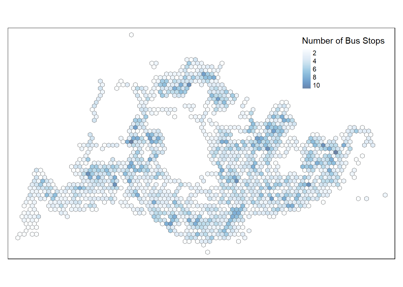
3.2.2.2 Geospatial Data Wrangling
(a) Combining Busstop and hexagon layer
Code chunk below populates the grid ID (i.e. grid_id) of hexagon_w_busstops sf data frame into busstop sf data frame using the following functions:
st_intersection()is used to perform point and polygon overly and the output will be in point sf object.select()of dplyr package is then use to retain preferred variables from the data frames.st_stop_geometry()removes the geometry data to manipulate it like a regular dataframe usingtidyranddplyrfunctions
bs_wgrids <- st_intersection(busstop, hexagon_w_busstops) %>%
select(BUS_STOP_N,BUS_ROOF_N,LOC_DESC, grid_id) %>%
st_drop_geometryBefore we proceed, let’s perform a duplicates check on bs_wgrids.
duplicate2 <- bs_wgrids %>%
group_by_all() %>%
filter(n()>1) %>%
ungroup()
duplicate2# A tibble: 8 × 4
BUS_STOP_N BUS_ROOF_N LOC_DESC grid_id
<chr> <chr> <chr> <int>
1 43709 B06 BLK 644 1904
2 43709 B06 BLK 644 1904
3 58031 UNK OPP CANBERRA DR 2939
4 58031 UNK OPP CANBERRA DR 2939
5 51071 B21 MACRITCHIE RESERVOIR 3081
6 51071 B21 MACRITCHIE RESERVOIR 3081
7 97079 B14 OPP ST. JOHN'S CRES 5037
8 97079 B14 OPP ST. JOHN'S CRES 5037Results displayed 4 seemingly genuine duplicated records, with same bus stop number, roof, and location description. We remove these to prevent double-counting.
The code chunk below helps retain unique records.
bs_wgrids <- unique(bs_wgrids)(b) Populate PeakPeriods with Grid Details
We can now append the grid ID from bs_wgrids data frame onto peakperiods_wide data frame using left_join. Recall we previously identified 5 bus stops outside Singapore, filter() allows us to exclude the 5 outside Singapore. LOC_DESC = first(LOC_DESC) geta the first location description for each grid_id group, this allows us to have a rough reference of the name of the bus stop when visualising later. sum() totals up the passenger trips at the hexagonal level. Lastly, we retain only the grids with passenger trip records and bus stop information.
origin_grid <- left_join(peakperiods_wide, bs_wgrids,
by = c("ORIGIN_PT_CODE" = "BUS_STOP_N")) %>%
rename(ORIGIN_BS = ORIGIN_PT_CODE) %>%
filter(!ORIGIN_BS %in% c(46239, 46609, 47701, 46211, 46219)) %>% # retains SG bus stops
group_by(grid_id) %>%
summarise(
LOC_DESC = first(LOC_DESC),
WDA = sum(WDA),
WDM = sum(WDM),
WEM = sum(WEM),
WEE = sum(WEE)
) %>%
filter(!is.na(grid_id))
# View results
glimpse(origin_grid)Rows: 1,503
Columns: 6
$ grid_id <int> 34, 65, 99, 127, 129, 130, 131, 159, 160, 161, 163, 190, 191,…
$ LOC_DESC <chr> "AFT TUAS STH BLVD", "BEF TUAS STH AVE 14", "YONG NAM", "OPP …
$ WDA <dbl> 417, 110, 249, 1810, 2985, 220, 325, 318, 196, 2633, 173, 555…
$ WDM <dbl> 62, 50, 44, 155, 1201, 73, 82, 59, 123, 773, 407, 183, 168, 2…
$ WEM <dbl> 5, 24, 27, 148, 512, 75, 43, 23, 39, 556, 47, 76, 58, 1377, 3…
$ WEE <dbl> 65, 26, 54, 303, 637, 35, 49, 43, 141, 981, 162, 124, 79, 138…3.2.2.3 Variable Transformation
Let’s visualise the distribution of passenger trips using a histogram with the ggplot2 package.
Show the code
# Weekday Morning
# Extract column
distWDM <- origin_grid$WDM
# Calculate mean
distWDM_mean <- mean(distWDM)
plot_distWDM <- ggplot(
data = data.frame(distWDM),
aes(x = distWDM)
) +
geom_histogram(
bins = 20,
color = "#FFFCF9",
fill = "black",
alpha = .3
) +
# Add line for mean
geom_vline(
xintercept = distWDM_mean,
color = "#595DE5",
linetype = "dashed",
linewidth = 1
) +
# Add line annotations
annotate(
"text",
x = 55000,
y = 1200,
label = paste("Mean =", round(distWDM_mean, 3)),
color = "#595DE5",
size = 3
) +
labs(
title = "Weekday Morning Peak",
x = "Bus Trips",
y = "Frequency"
) +
theme(
axis.text.x = element_text(angle = 45, hjust=1)
) +
scale_x_continuous(labels = label_number(), n.breaks=8)
# Weekday Afternoon
# Extract column
distWDA <- origin_grid$WDA
# Calculate mean
distWDA_mean <- mean(distWDA)
plot_distWDA <- ggplot(
data = data.frame(distWDA),
aes(x = distWDA)
) +
geom_histogram(
bins = 20,
color = "#FFFCF9",
fill = "black",
alpha = .3
) +
# Add line for mean
geom_vline(
xintercept = distWDA_mean,
color = "#595DE5",
linetype = "dashed",
linewidth = 1
) +
# Add line annotations
annotate(
"text",
x = 140000,
y = 1200,
label = paste("Mean =", round(distWDA_mean, 3)),
color = "#595DE5",
size = 3
) +
labs(
title = "Weekday Afternoon Peak",
x = "Bus Trips",
y = "Frequency"
) +
theme(
axis.text.x = element_text(angle = 45, hjust=1)
) +
scale_x_continuous(labels = label_number(), n.breaks=8)
# Weekend Morning
# Extract column
distWEM <- origin_grid$WEM
# Calculate mean
distWEM_mean <- mean(distWEM)
plot_distWEM <- ggplot(
data = data.frame(distWEM),
aes(x = distWEM)
) +
geom_histogram(
bins = 20,
color = "#FFFCF9",
fill = "black",
alpha = .3
) +
# Add line for mean
geom_vline(
xintercept = distWEM_mean,
color = "#595DE5",
linetype = "dashed",
linewidth = 1
) +
# Add line annotations
annotate(
"text",
x = 33000,
y = 1200,
label = paste("Mean =", round(distWEM_mean, 3)),
color = "#595DE5",
size = 3
) +
labs(
title = "Weekdend/Holiday Morning Peak",
x = "Bus Trips",
y = "Frequency"
) +
theme(
axis.text.x = element_text(angle = 45, hjust=1)
) +
scale_x_continuous(labels = label_number(), n.breaks=8)
# Weekend Evening
# Extract column
distWEE <- origin_grid$WEE
# Calculate mean
distWEE_mean <- mean(distWEE)
plot_distWEE <- ggplot(
data = data.frame(distWEE),
aes(x = distWEE)
) +
geom_histogram(
bins = 20,
color = "#FFFCF9",
fill = "black",
alpha = .3
) +
# Add line for mean
geom_vline(
xintercept = distWEE_mean,
color = "#595DE5",
linetype = "dashed",
linewidth = 1
) +
# Add line annotations
annotate(
"text",
x = 39000,
y = 1200,
label = paste("Mean =", round(distWEE_mean, 3)),
color = "#595DE5",
size = 3
) +
labs(
title = "Weekend/Holiday Evening Peak",
x = "Bus Trips",
y = "Frequency"
) +
theme(
axis.text.x = element_text(angle = 45, hjust=1)
) +
scale_x_continuous(labels = label_number(), n.breaks=8)
(plot_distWDM | plot_distWDA)/
(plot_distWEM | plot_distWEE)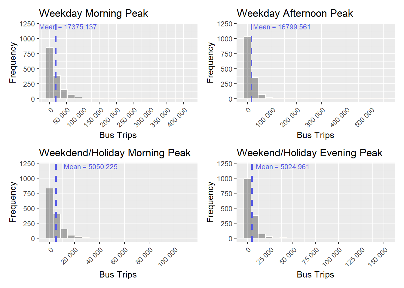
The distribution of passenger trips for the 4 peak periods at a hexagon level appear to be highly skewed to the right. Rescaling our data using log transformation can greatly reduce the skewness and make patterns more evident for analysis.
ifelse() in the code chunk below checks for 0 values and performs log-transformation if the value is non-zero. This is crucial because log of 0 is undefined.
origin_grid_wider <- origin_grid %>%
mutate(logWDM = ifelse(WDM == 0, 0, log(WDM)),
logWDA = ifelse(WDA == 0, 0, log(WDA)),
logWEM = ifelse(WEM == 0, 0, log(WEM)),
logWEE = ifelse(WEE == 0, 0, log(WEE)))Let’s visualise the distribution of the 4 peak periods again.
Show the code
# Weekday Morning
# Extract column
distlogWDM <- origin_grid_wider$logWDM
# Calculate mean
distlogWDM_mean <- mean(distlogWDM)
plot_distlogWDM <- ggplot(
data = data.frame(distlogWDM),
aes(x = distlogWDM)
) +
geom_histogram(
bins = 20,
color = "#FFFCF9",
fill = "#34414E",
alpha = .3
) +
# Add line for mean
geom_vline(
xintercept = distlogWDM_mean,
color = "#595DE5",
linetype = "dashed",
linewidth = 1
) +
# Add line annotations
annotate(
"text",
x = 12,
y = 300,
label = paste("Mean =", round(distlogWDM_mean, 3)),
color = "#595DE5",
size = 3
) +
labs(
title = "Weekday Morning Peak",
x = "Bus Trips",
y = "Frequency"
) +
theme(
axis.text.x = element_text(angle = 45, hjust=1)
)
# Weekday Afternoon
# Extract column
distlogWDA <- origin_grid_wider$logWDA
# Calculate mean
distlogWDA_mean <- mean(distlogWDA)
plot_distlogWDA <- ggplot(
data = data.frame(distlogWDA),
aes(x = distlogWDA)
) +
geom_histogram(
bins = 20,
color = "#FFFCF9",
fill = "#34414E",
alpha = .3
) +
# Add line for mean
geom_vline(
xintercept = distlogWDA_mean,
color = "#595DE5",
linetype = "dashed",
linewidth = 1
) +
# Add line annotations
annotate(
"text",
x = 12,
y = 300,
label = paste("Mean =", round(distlogWDA_mean, 3)),
color = "#595DE5",
size = 3
) +
labs(
title = "Weekday Afternoon Peak",
x = "Bus Trips",
y = "Frequency"
) +
theme(
axis.text.x = element_text(angle = 45, hjust=1)
)
# Weekend Morning
# Extract column
distlogWEM <- origin_grid_wider$logWEM
# Calculate mean
distlogWEM_mean <- mean(distlogWEM)
plot_distlogWEM <- ggplot(
data = data.frame(distlogWEM),
aes(x = distlogWEM)
) +
geom_histogram(
bins = 20,
color = "#FFFCF9",
fill = "#34414E",
alpha = .3
) +
# Add line for mean
geom_vline(
xintercept = distlogWEM_mean,
color = "#595DE5",
linetype = "dashed",
linewidth = 1
) +
# Add line annotations
annotate(
"text",
x = 10,
y = 300,
label = paste("Mean =", round(distlogWEM_mean, 3)),
color = "#595DE5",
size = 3
) +
labs(
title = "Weekdend/Holiday Morning Peak",
x = "Bus Trips",
y = "Frequency"
) +
theme(
axis.text.x = element_text(angle = 45, hjust=1)
)
# Weekend Evening
# Extract column
distlogWEE <- origin_grid_wider$logWEE
# Calculate mean
distlogWEE_mean <- mean(distlogWEE)
plot_distlogWEE <- ggplot(
data = data.frame(distlogWEE),
aes(x = distlogWEE)
) +
geom_histogram(
bins = 20,
color = "#FFFCF9",
fill = "#34414E",
alpha = .3
) +
# Add line for mean
geom_vline(
xintercept = distlogWEE_mean,
color = "#595DE5",
linetype = "dashed",
linewidth = 1
) +
# Add line annotations
annotate(
"text",
x = 10,
y = 300,
label = paste("Mean =", round(distlogWEE_mean, 3)),
color = "#595DE5",
size = 3
) +
labs(
title = "Weekend/Holiday Evening Peak",
x = "Bus Trips",
y = "Frequency"
) +
theme(
axis.text.x = element_text(angle = 45, hjust=1)
)
(plot_distlogWDM | plot_distlogWDA)/
(plot_distlogWEM | plot_distlogWEE)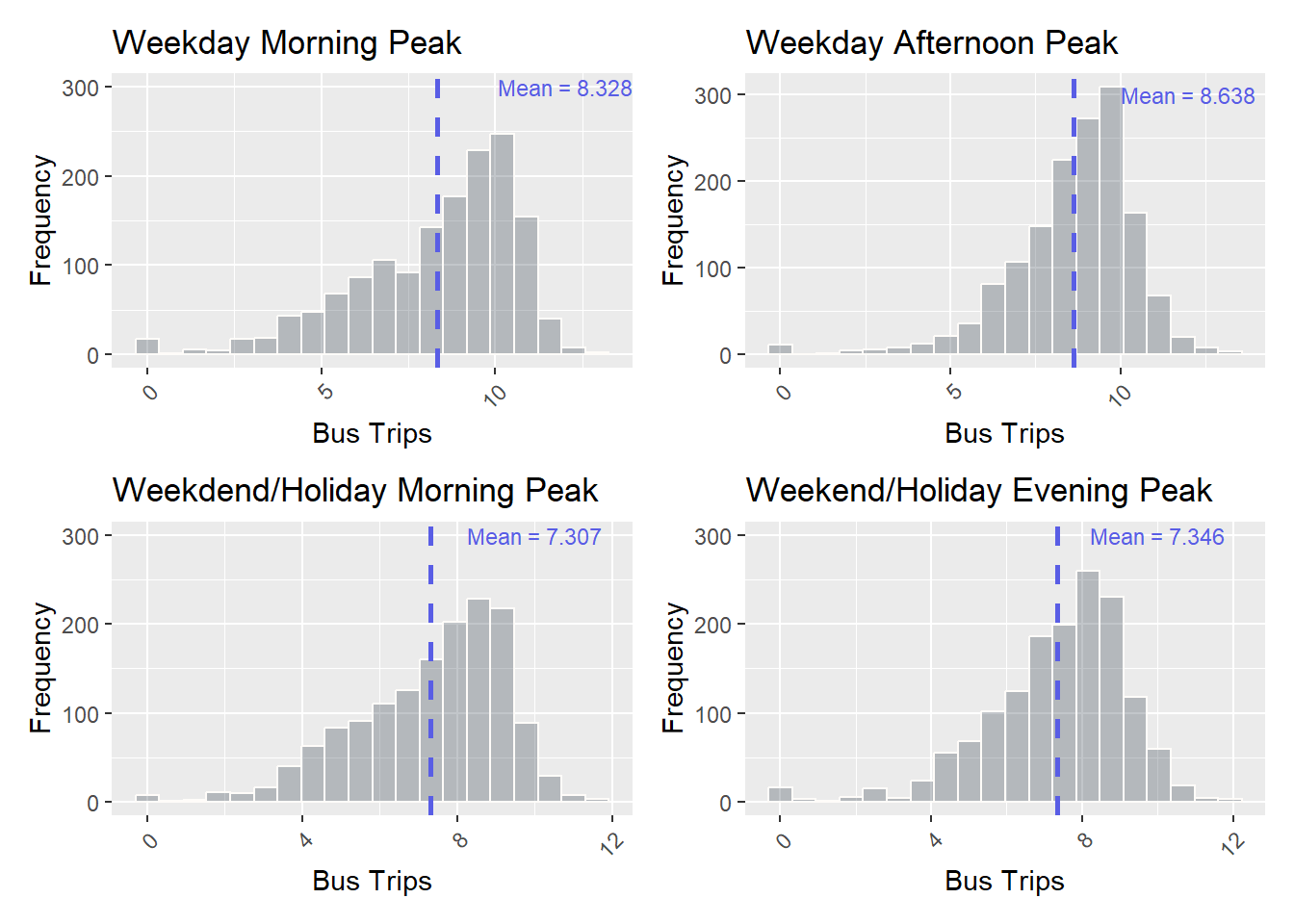
3.2.2.4 Retrieve Geometry
Now, we can finally add in the geometry for each hexagon grid using an inner_join() between hexagon_w_busstops (geospatial data) and origin_grid_wider (aspatial data). This ensures that only common grids in the two data sets are retained.
origin_gridwgeom <- inner_join(hexagon_w_busstops,
origin_grid_wider,
by = "grid_id")In order to retain the geospatial properties, the left data frame must the sf data.frame (i.e. hexagon_w_busstop).
4 Geovisualisation & Analysis
4.1 Data Classification
Different classification schemes highlight areas with the highest and/or lowest values, while others create classes that result in a more uniform distribution of colors. When data is sharply skewed or has extreme outliers, it’s important to consider whether the goal is to emphasize those areas or to achieve a more even distribution of colors and sizes.
The main methods of data classification are:
Quantile: each class contains an equal number of features. It assigns the same number of data values to each class. There are no empty classes or classes with too few or too many values
Jenks/Natural breaks: seeks clumps of values that are clustered together in order to form categories that may reflect meaningful groupings of areas
Equal: divides the range of attribute values into equal-sized sub-ranges
Since our variable is less skewed after log transformation, we can explore various classification methods for visualization. This approach may reveal interesting insights that were not immediately apparent before.
4.2 Visualising Bus Ridership
We will visualise the spatial distribution of ridership for each peak period using a choropleth. This is performed using the code chunk below.
Show the code
tmap_mode ("plot")
plotlogWDM_q <-
tm_shape(origin_gridwgeom) +
tm_fill("logWDM",
style = "quantile",
palette = "Blues",
title = "Total passenger trips",
alpha=0.6) +
tm_borders(alpha = 0.5)+
tm_layout(main.title="Quantile Classification",
main.title.size = 0.7,
main.title.position = "center",
legend.height = 0.35,
legend.width = 0.25,
frame = FALSE)
plotlogWDM_e <-
tm_shape(origin_gridwgeom) +
tm_fill("logWDM",
style = "equal",
palette = "Blues",
title = "Total passenger trips",
alpha=0.6,
id="LOC_DESC") +
tm_borders(alpha = 0.5)+
tm_layout(main.title="Equal Interval Classification",
main.title.size = 0.7,
main.title.position = "center",
legend.height = 0.35,
legend.width = 0.25,
frame = FALSE)
plotlogWDM_j <-
tm_shape(origin_gridwgeom) +
tm_fill("logWDM",
style = "jenks",
palette = "Blues",
title = "Total passenger trips",
alpha=0.6,
id="LOC_DESC") +
tm_borders(alpha = 0.5)+
tm_layout(main.title="Jenks Classification",
main.title.size = 0.7,
main.title.position = "center",
legend.height = 0.35,
legend.width = 0.25,
frame = FALSE)
tmap_arrange(plotlogWDM_q, plotlogWDM_e, plotlogWDM_j, asp=1, ncol=3)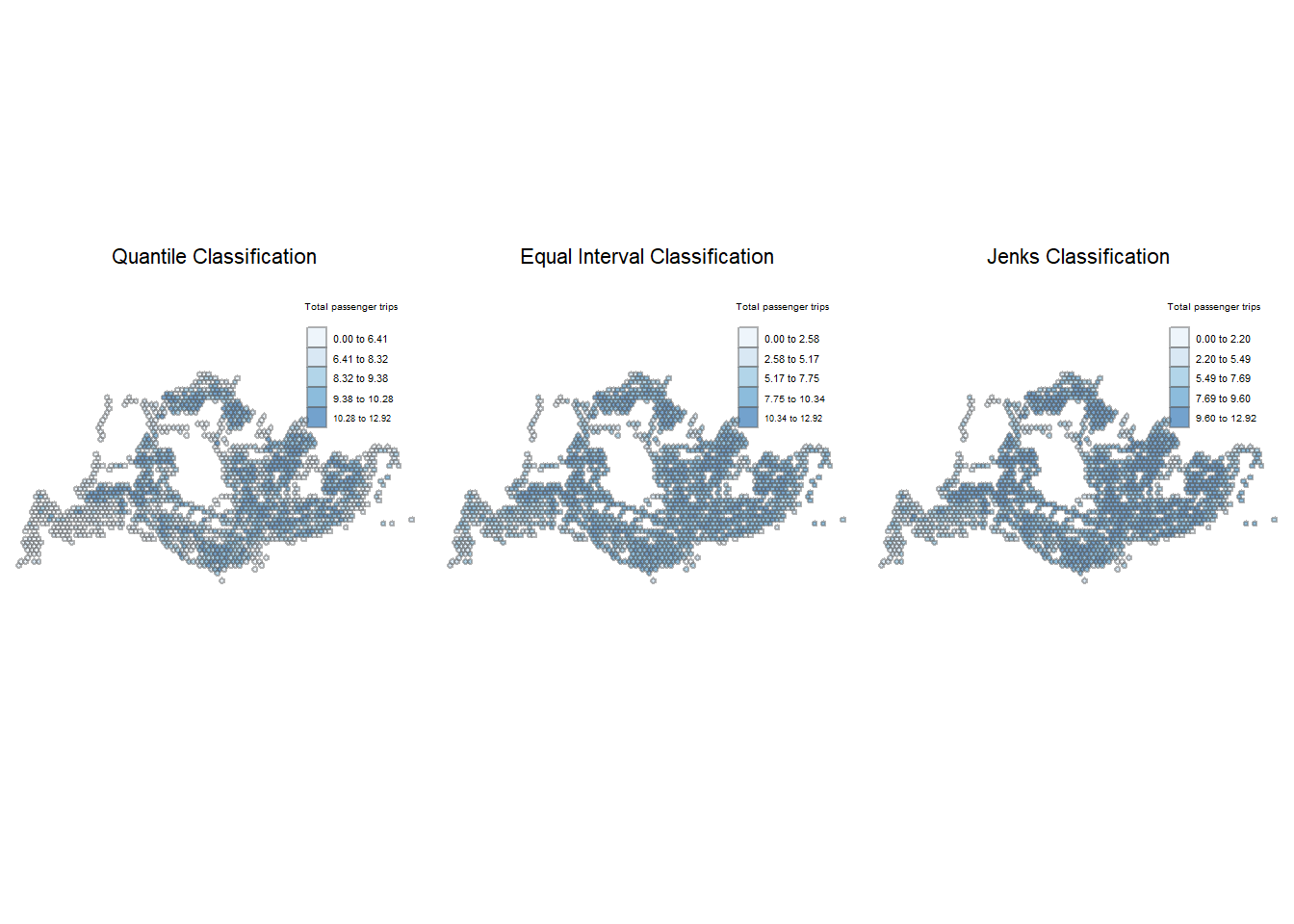
The leftmost map above is partitioned using the quantile intervals. We can observe that the bus trips are unevenly distributed across Singapore. There are lighter shares of blue (indicating lower levels of ridership) originating from the edges of the country, particularly in the West, while higher levels of ridership in the North region are indicated by the darker shades of blue.
Bus stops nearer to the residential estates appeared to be popular during the weekday morning peak period. This is likely due to a large number of people commuting from home to their workplaces/schools on weekday mornings.
Lastly, Woodlands Checkpoint also demonstrated higher ridership. Woodlands Checkpoint is one of Singapore’s two land border checkpoints, facilitating the movement of ground traffic between Singapore and Malaysia. This could potentially be due to the people commuting across the causeway between Malaysia and Singapore.
The map using equal intervals had more homogeneity – the contrast between hexagon to hexagon is less obvious. There appears to be more spots of dark blue, indicating more areas with high ridership.
Using Jenk’s partitioning method, the results were largely similar to the other two types of interval classes.
Show the code
tmap_mode ("plot")
plotlogWDA_q <-
tm_shape(origin_gridwgeom) +
tm_fill("logWDA",
style = "quantile",
palette = "Reds",
title = "Total passenger trips",
alpha=0.6) +
tm_borders(alpha = 0.5)+
tm_layout(main.title="Quantile Classification",
main.title.size = 0.7,
main.title.position = "center",
legend.height = 0.35,
legend.width = 0.25,
frame = FALSE)
plotlogWDA_e <-
tm_shape(origin_gridwgeom) +
tm_fill("logWDA",
style = "equal",
palette = "Reds",
title = "Total passenger trips",
alpha=0.6,
id="LOC_DESC") +
tm_borders(alpha = 0.5)+
tm_layout(main.title="Equal Interval Classification",
main.title.size = 0.7,
main.title.position = "center",
legend.height = 0.35,
legend.width = 0.25,
frame = FALSE)
plotlogWDA_j <-
tm_shape(origin_gridwgeom) +
tm_fill("logWDA",
style = "jenks",
palette = "Reds",
title = "Total passenger trips",
alpha=0.6,
id="LOC_DESC") +
tm_borders(alpha = 0.5)+
tm_layout(main.title="Jenks Classification",
main.title.size = 0.7,
main.title.position = "center",
legend.height = 0.35,
legend.width = 0.25,
frame = FALSE)
tmap_arrange(plotlogWDA_q, plotlogWDA_e, plotlogWDA_j, asp=1, ncol=3)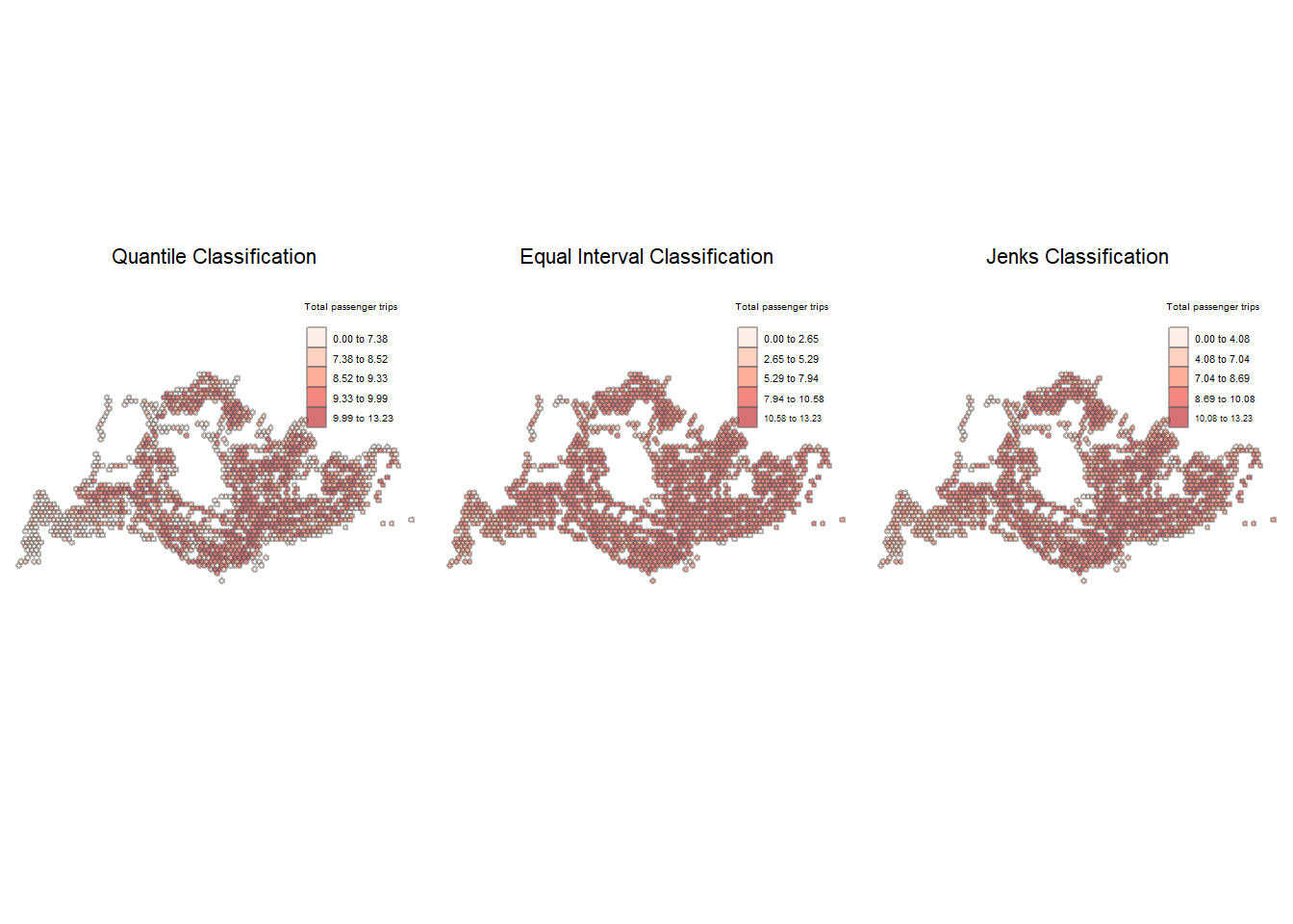
A look at the weekday afternoon ridership using the quantile classification yielded the following insights.
- Ridership from Woodlands Checkpoint remained high.
- More trips originating from industrial/business parks: Mapletree Business City, Woodlands Auto Hub, Opp Airline Hse, etc.
- Seletar Camp also looked to have high passenger levels
- Southern part of Singapore, consisting of more commercial areas, appeared to be more clustered as illustrated by the density of the darker red hexagons, compared to the weekday morning peak period.
Using the Equal Interval classification, there were notably higher concentration of passengers trips across the island, producing more homogeneous classifications.
Jenk’s classification delivered similar insights to the quantile classification, where the higher concentration of ridership can be observed in the Southern downtown areas. It also highlighted Opp Airline Hse in the far East as a bus stop with high ridership, something not as visible using the equal interval method. Alternative methods of commute might be more popular in the West and North-West regions illustrated by the lighter shades of red hexagons.
Show the code
tmap_mode ("plot")
plotlogWEM_q <-
tm_shape(origin_gridwgeom) +
tm_fill("logWEM",
style = "quantile",
palette = "Blues",
title = "Total passenger trips",
alpha=0.6) +
tm_borders(alpha = 0.5)+
tm_layout(main.title="Quantile Classification",
main.title.size = 0.7,
main.title.position = "center",
legend.height = 0.35,
legend.width = 0.25,
frame = FALSE)
plotlogWEM_e <-
tm_shape(origin_gridwgeom) +
tm_fill("logWEM",
style = "equal",
palette = "Blues",
title = "Total passenger trips",
alpha=0.6,
id="LOC_DESC") +
tm_borders(alpha = 0.5)+
tm_layout(main.title="Equal Interval Classification",
main.title.size = 0.7,
main.title.position = "center",
legend.height = 0.35,
legend.width = 0.25,
frame = FALSE)
plotlogWEM_j <-
tm_shape(origin_gridwgeom) +
tm_fill("logWEM",
style = "jenks",
palette = "Blues",
title = "Total passenger trips",
alpha=0.6,
id="LOC_DESC") +
tm_borders(alpha = 0.5)+
tm_layout(main.title="Jenks Classification",
main.title.size = 0.7,
main.title.position = "center",
legend.height = 0.35,
legend.width = 0.25,
frame = FALSE)
tmap_arrange(plotlogWEM_q, plotlogWEM_e, plotlogWEM_j, asp=1, ncol=3)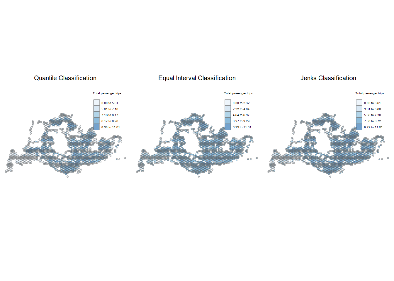
Generally, the distribution of bus ridership looks varied across the island.
The map partitioned using the quantile intervals showed that during the weekend/holiday peak period, the ridership for far West region remained relatively low. Interestingly, the bus trips recorded from Seletar area appeared to have dipped compared to the weekday peak periods. This suggests that buses in these industrial areas could be oriented towards work-related travel, thus less common on weekends. Bus stops nearer to housing estates, shopping malls, and Woodlands Checkpoint demonstrated higher levels of weekend morning ridership.
The map using interval classification looked more monochromatic, there is less contrast with a more uniform appearance. On the other hand, Jenk’s method identified more hot spots across the island than the other two methods.
Show the code
tmap_mode ("plot")
plotlogWEE_q <-
tm_shape(origin_gridwgeom) +
tm_fill("logWEE",
style = "quantile",
palette = "Reds",
title = "Total passenger trips",
alpha=0.6) +
tm_borders(alpha = 0.5)+
tm_layout(main.title="Quantile Classification",
main.title.size = 0.7,
main.title.position = "center",
legend.height = 0.35,
legend.width = 0.25,
frame = FALSE)
plotlogWEE_e <-
tm_shape(origin_gridwgeom) +
tm_fill("logWEE",
style = "equal",
palette = "Reds",
title = "Total passenger trips",
alpha=0.6,
id="LOC_DESC") +
tm_borders(alpha = 0.5)+
tm_layout(main.title="Equal Interval Classification",
main.title.size = 0.7,
main.title.position = "center",
legend.height = 0.35,
legend.width = 0.25,
frame = FALSE)
plotlogWEE_j <-
tm_shape(origin_gridwgeom) +
tm_fill("logWEE",
style = "jenks",
palette = "Reds",
title = "Total passenger trips",
alpha=0.6,
id="LOC_DESC") +
tm_borders(alpha = 0.5)+
tm_layout(main.title="Jenks Classification",
main.title.size = 0.7,
main.title.position = "center",
legend.height = 0.35,
legend.width = 0.25,
frame = FALSE)
tmap_arrange(plotlogWEE_q, plotlogWEE_e, plotlogWEE_j, asp=1, ncol=3)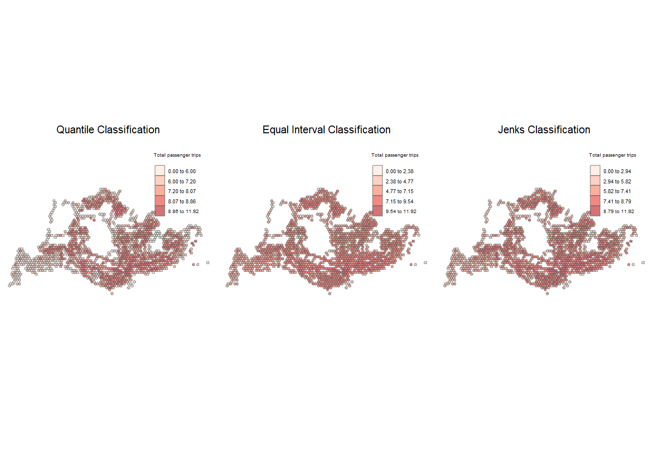
On weekend/holiday evenings, there seemed to be increased ridership at the bus stops near Changi Airport compared to the other peak periods as witnessed in the first plot using the quantile classification method. Sunshine Plaza remains one of the most frequented bus stops, exhibiting high ridership across all four peak periods. While the exact reason for this is difficult to pinpoint, it’s possible that the buses stopping here connect to a wide variety of regions, which could explain the high ridership. Woodlands Checkpoint also demonstrated high levels of ridership across the different peak periods.
Visually, it looks like there are more bus stops with high ridership across Singapore during the weekend/holiday evening peak period. For example, there seem to be an increase in passenger volume at the Tanah Merah Ferry compared to the other peak periods.
Using the equal interval classification method, the general areas of bus stops with higher traffic seem to be quite consistent across the different peak periods.
The Jenk’s method seems to suggest that hot spots are mostly congregated in the core of Singapore, with cold spots along the periphery of Singapore.
While the choropleths were useful for quickly visualizing results, the different plots reveal that varying data classification methods can lead to different findings. To draw objective conclusions, we should supplement our initial findings with geospatial analysis.
5 Spatial Association Analysis
According to Tobler’s First Law of Geography, “everything is related to everything else, but near things are more related than distant things.”
This sub-section will cover the computation of local spatial autocorrelation statistics and spatial complete randomness test for local spatial autocorrelation. The goal of these analyses is to understand whether there are clusters or outliers of bus stop with high or low ridership across Singapore.
5.1 Spatial Weights Matrix
To compute the local spatial autocorrelation statistics, we first need to construct a spatial weights of Singapore. Spatial relationships are multi-directional and multi-lateral. We can use spatial weights to define who the neighbours of the spatial units.
There are two common methods of spatial weights: contiguity-based and distance-based.
Contiguity-based: Neighbours share a common boundary, which can be further distinguished between a Rook and a Queen criterion of contiguity. Rook contiguity defines neighbours by the existence of a common edge between two spatial units. In Queen contiguity defines neighbours as spatial units sharing a common edge or a common vertex.
Distance-based: Assign higher weights to pairs of locations that are closer to each other and lower weights to pairs that are further. This can be further distinguished by fixed weighting, adaptive weighting and inverse-distance weighting schemes. Fixed weighting scheme considers two regions are neighbours if they are within a specified distance from one another. For adaptive weighting scheme, each region will have the same number of neighbours. The number of neighbour is specified beforehand, where k = number of neighbours. Inverse distance method considers that the closer two features are in space, the more likely they are to interact/influence each other.
For this study, we will be using distance-based weight matrix as there are areas where bus stops are sparse (such as Lim Chu Kang and Mandai) and isolated (for example, Tanah Merah Ferry, Changi Naval Base, Resort World Sentosa, Marina Bay Cruise Centre). Consequently, contiguity-based matrix may yield many regions with no neighbours, making it not suitable for our analysis.
Step 1: Determine Cut-Off Distance Limit
First step is to determine the upper distance limit to ensure that each hexagon has at least 1 neighbour.
The following functions can be used:
- st_knn() of sfdep is used to identify neighbors based on k (e.g. k = 8 indicates the nearest eight neighbours). The output is a neighbours list of class nb. If polygon geometry is provided, the centroids of the polygon will be used for calculation.
- st_nb_dists() of sfdep is used to calculate the nearest neighbour distance. The output is a list of distances for each observation’s neighbors list.
- unlist() of Base R is then used to return the output as a vector so that the summary statistics of the nearest neighbour distances can be derived.
geo <- sf::st_geometry(origin_gridwgeom)
nb <- st_knn(geo,
longlat = TRUE)
dists <- unlist(st_nb_dists(geo, nb))Step 2: Derive Summary Stats
We can derive summary statistics of the nearest neighbour distances vector (i.e. dists) by using the code chunk below.
summary(dists) Min. 1st Qu. Median Mean 3rd Qu. Max.
500.0 500.0 500.0 503.4 500.0 2291.3 The maximum nearest neighbour distance is 2291.3m, thus we will use threshold value of 2292m to ensure each spatial unit has a minimum of 1 neighbour.
Step 3: Compute fixed distance weight
Now we will go ahead to compute the fixed distance weights by using following functions:
st_dists_band() of sfdep is used to identify neighbors based on a distance band (i.e. 1000m). The output is a list of neighbours (i.e. nb). st_weights() is then used to calculate polygon spatial weights of the nb list. Note that the default style argument is set to “W” for row standardized weights, and the default allow_zero is set to TRUE, assigns zero as lagged value to zone without neighbors.
wm_fd <- origin_gridwgeom %>%
mutate(nb = st_dist_band(geo,
upper = 2992),
wt = st_weights(nb),
.before = 1)Step 4: Observations
Show the code
summary(wm_fd$nb)Neighbour list object:
Number of regions: 1503
Number of nonzero links: 106746
Percentage nonzero weights: 4.725346
Average number of links: 71.02196
Link number distribution:
1 2 4 9 10 11 12 13 14 15 16 17 19 20 21 22 23 24 25 26
1 1 1 4 2 2 3 1 2 3 3 1 2 2 1 1 6 5 3 3
27 28 29 30 31 32 33 34 35 36 37 38 39 40 41 42 43 44 45 46
8 9 4 3 7 2 7 6 4 9 9 5 13 10 7 9 9 12 13 16
47 48 49 50 51 52 53 54 55 56 57 58 59 60 61 62 63 64 65 66
15 11 13 19 18 15 19 19 24 16 12 22 20 29 24 25 9 33 27 15
67 68 69 70 71 72 73 74 75 76 77 78 79 80 81 82 83 84 85 86
20 24 21 24 26 23 24 20 30 19 20 24 23 22 32 29 20 23 26 33
87 88 89 90 91 92 93 94 95 96 97 98 99 100 101 102 103 104 105 106
29 30 31 31 25 24 22 23 18 27 18 26 20 13 17 12 16 6 14 7
107 108 109 110
5 6 3 3
1 least connected region:
1503 with 1 link
3 most connected regions:
1013 1024 1050 with 110 linksFrom the result above, we can confirm that all hexagons have at least one neighbour and there are 3 well-connected hexagons with 110 neighbours. We can also identify an average of 71 neighbours per hexagon using the distance-based weight matrix.
A characteristic of fixed distance weights matrix is that more densely settled areas (town, residential neighbourhoods) tend to have more neigbours while less densely settle areas (military camps, industrial estates) tend to have less neighbours. To overcome the issue of fixed distance weight matrix where there is uneven distribution of neighbours, we can directly control the number of neighbours using k-nearest neighbours by setting the value of k in the code chunk below.
As a rule-of-thumb, we will set k = 8 i.e., all hexagons will have 8 neighbours.
wm_ad <- origin_gridwgeom %>%
mutate(nb = st_knn(geo,
k=8),
wt = st_weights(nb),
.before = 1)
head(wm_ad, n=3)Simple feature collection with 3 features and 13 fields
Geometry type: POLYGON
Dimension: XY
Bounding box: xmin: 3720.122 ymin: 27925.48 xmax: 4720.122 ymax: 31100.9
Projected CRS: SVY21 / Singapore TM
nb
1 2, 4, 5, 8, 9, 12, 22, 23
2 1, 4, 5, 8, 9, 12, 22, 23
3 5, 6, 9, 10, 13, 14, 16, 17
wt grid_id busstops
1 0.125, 0.125, 0.125, 0.125, 0.125, 0.125, 0.125, 0.125 34 1
2 0.125, 0.125, 0.125, 0.125, 0.125, 0.125, 0.125, 0.125 65 1
3 0.125, 0.125, 0.125, 0.125, 0.125, 0.125, 0.125, 0.125 99 1
LOC_DESC WDA WDM WEM WEE logWDM logWDA logWEM logWEE
1 AFT TUAS STH BLVD 417 62 5 65 4.127134 6.033086 1.609438 4.174387
2 BEF TUAS STH AVE 14 110 50 24 26 3.912023 4.700480 3.178054 3.258097
3 YONG NAM 249 44 27 54 3.784190 5.517453 3.295837 3.988984
area_hexagon_grid
1 POLYGON ((3970.122 27925.48...
2 POLYGON ((4220.122 28358.49...
3 POLYGON ((4470.122 30523.55...The results show that the weights of the neighbours have been assigned to 1/8 (0.125) of the total weight, representing each of the 8 neighbours.
Inverse distance weights takes into account the decay functions of distance.
We can derive spatial weight matrix based on inverse distance method using the following functions:
- st_knn() of sfdep is used to identify neighbors based on k (e.g. k = 8 indicates the nearest eight neighbours). The output is a neighbours list of class nb. If polygon geometry is provided, the centroids of the polygon will be used for calculation.
- st_inverse_distance() is then used to calculate inverse distance weights of neighbours on the nb list.
For our analysis, we will set the number of neighbours to 8.
wm_idw <- origin_gridwgeom %>%
mutate(nb = st_knn(geo,
k=8),
wts = st_inverse_distance(nb, geo,
scale = 1,
alpha = 1),
.before = 1)
head(wm_idw, n=3)Simple feature collection with 3 features and 13 fields
Geometry type: POLYGON
Dimension: XY
Bounding box: xmin: 3720.122 ymin: 27925.48 xmax: 4720.122 ymax: 31100.9
Projected CRS: SVY21 / Singapore TM
nb
1 2, 4, 5, 8, 9, 12, 22, 23
2 1, 4, 5, 8, 9, 12, 22, 23
3 5, 6, 9, 10, 13, 14, 16, 17
wts
1 0.0020000000, 0.0011547005, 0.0004364358, 0.0007559289, 0.0005000000, 0.0005547002, 0.0005547002, 0.0004588315
2 0.0020000000, 0.0020000000, 0.0005547002, 0.0011547005, 0.0006666667, 0.0007559289, 0.0006666667, 0.0005773503
3 0.0020000000, 0.0020000000, 0.0010000000, 0.0020000000, 0.0011547005, 0.0011547005, 0.0007559289, 0.0010000000
grid_id busstops LOC_DESC WDA WDM WEM WEE logWDM logWDA
1 34 1 AFT TUAS STH BLVD 417 62 5 65 4.127134 6.033086
2 65 1 BEF TUAS STH AVE 14 110 50 24 26 3.912023 4.700480
3 99 1 YONG NAM 249 44 27 54 3.784190 5.517453
logWEM logWEE area_hexagon_grid
1 1.609438 4.174387 POLYGON ((3970.122 27925.48...
2 3.178054 3.258097 POLYGON ((4220.122 28358.49...
3 3.295837 3.988984 POLYGON ((4470.122 30523.55...The inverse distance approach is best suited for continuous data or for modeling scenarios where spatial proximity increases the likelihood of interaction or influence between two features. Nevertheless, this method treats every feature as a potential neighbor to every other feature, which can lead to a significant computational burden, especially in the case of large datasets where the volume of calculations required becomes substantial.
In summary:
- The number of neighbours using fixed distance method vary widely from 1 to 102. Consequently, the uneven distribution could affect the spatial autocorrelation analysis.
- Inverse distance method is computationally intensive as each feature is potentially a neighbour of every other feature.
- Since each hexagon is equally sized, the adaptive distance-based spatial weight matrix would be best suited for our analysis since each centroid can represent each region well.
5.2 Global Spatial Autocorrelation Statistics
We will perform Moran’s I statistical testing by using global_moran_perm() of spdep. The Global Moran’s I Permutation Test is a statistical method used in spatial analysis to assess the significance of spatial autocorrelation in a dataset. Spatial autocorrelation refers to the degree to which a variable is correlated with itself across space, indicating patterns such as clustering or dispersion.
The Moran I statistic ranges from -1 to 1. If the Moran I is:
- positive (I>0): Clustered, observations tend to be similar
- negative (I<0): Disperse, observations tend to be dissimilar
- approximately zero: observations arranged randomly over space
The code chunk below performs Moran’s I statistical testing with the adaptive weight matrix (i.e. wm_ad), using the null and alternative hypotheses as follows:
H0: The observed spatial patterns of proportion of bus ridership in Singapore are not clustered (i.e. either random or dispersed). H1: The observed spatial patterns of proportion of bus ridership in Singapore are clustered.
A total of 100 simulations will be performed using the original and logged values with a seed number 1234. set.seed() function allows us to create reproducible results.
set.seed(1234)Original Data
Show the code
gmp_WDM <- global_moran_perm(wm_ad$WDM,
wm_ad$nb,
wm_ad$wt,
nsim = 99)
gmp_WDM
Monte-Carlo simulation of Moran I
data: x
weights: listw
number of simulations + 1: 100
statistic = 0.19938, observed rank = 100, p-value < 2.2e-16
alternative hypothesis: two.sidedLog-Transformed Variable
Show the code
gmp_logWDM <- global_moran_perm(wm_ad$logWDM,
wm_ad$nb,
wm_ad$wt,
nsim = 99)
gmp_logWDM
Monte-Carlo simulation of Moran I
data: x
weights: listw
number of simulations + 1: 100
statistic = 0.5159, observed rank = 100, p-value < 2.2e-16
alternative hypothesis: two.sidedOriginal Data
Show the code
gmp_WDA <- global_moran_perm(wm_ad$WDA,
wm_ad$nb,
wm_ad$wt,
nsim = 99)
gmp_WDA
Monte-Carlo simulation of Moran I
data: x
weights: listw
number of simulations + 1: 100
statistic = 0.059528, observed rank = 100, p-value < 2.2e-16
alternative hypothesis: two.sidedLog-Transformed Data
Show the code
gmp_logWDA <- global_moran_perm(wm_ad$logWDA,
wm_ad$nb,
wm_ad$wt,
nsim = 99)
gmp_logWDA
Monte-Carlo simulation of Moran I
data: x
weights: listw
number of simulations + 1: 100
statistic = 0.35711, observed rank = 100, p-value < 2.2e-16
alternative hypothesis: two.sidedOriginal Data
Show the code
gmp_WEM <- global_moran_perm(wm_ad$WEM,
wm_ad$nb,
wm_ad$wt,
nsim = 99)
gmp_WEM
Monte-Carlo simulation of Moran I
data: x
weights: listw
number of simulations + 1: 100
statistic = 0.15158, observed rank = 100, p-value < 2.2e-16
alternative hypothesis: two.sidedLog-Transformed Data
Show the code
gmp_logWEM <- global_moran_perm(wm_ad$logWEM,
wm_ad$nb,
wm_ad$wt,
nsim = 99)
gmp_logWEM
Monte-Carlo simulation of Moran I
data: x
weights: listw
number of simulations + 1: 100
statistic = 0.49385, observed rank = 100, p-value < 2.2e-16
alternative hypothesis: two.sidedOriginal Data
Show the code
gmp_WEE <- global_moran_perm(wm_ad$WEE,
wm_ad$nb,
wm_ad$wt,
nsim = 99)
gmp_WEE
Monte-Carlo simulation of Moran I
data: x
weights: listw
number of simulations + 1: 100
statistic = 0.097321, observed rank = 100, p-value < 2.2e-16
alternative hypothesis: two.sidedLog-Transformed Data
Show the code
gmp_logWEE <- global_moran_perm(wm_ad$logWEE,
wm_ad$nb,
wm_ad$wt,
nsim = 99)
gmp_logWEE
Monte-Carlo simulation of Moran I
data: x
weights: listw
number of simulations + 1: 100
statistic = 0.40407, observed rank = 100, p-value < 2.2e-16
alternative hypothesis: two.sidedAcross the 4 peak periods, the permutation test generated low p-values of <0.05. This indicates that we can reject the null hypothesis at the 95% level of confidence, and conclude that for each of the 4 peak periods, the overall bus ridership across Singapore is spatially clustered (since positive Moran’s I value is obtained). The higher Moran’s I values for logged-transformed variables suggests a higher level of clustering compared to the original ridership values.
5.3 Local Spatial Autocorrelation Statistics
Global spatial autocorrelation provides a broad overview of spatial clustering within a dataset, offering a single value that indicates whether similar values are generally clustered or dispersed across the entire study area. In contrast, local spatial autocorrelation delves into specific locations, identifying where clusters of similar values (hot spots or cold spots) or spatial outliers exist. While global metrics give an overall trend, local metrics provide detailed, location-specific insights, highlighting exact areas of significant spatial clustering or anomaly.
Thus, after we have established through statistical testing that spatial clustering of bus ridership occurs in Singapore, we now seek to detect clusters or outliers and discover if there are any hot or cold spots of high ridership using Local Spatial Autocorrelation Statistics.
5.3.1 Local Moran’s I
In this section, we will perform Moran’s I statistics testing by using local_moran() of sfdep. The output of local_moran() is a sf data.frame, containing the columns below:
- ii: local moran statistic
- eii: expectation of local Moran’s I statistic
- var_ii: variance of local Moran’s I statistic
- z_ii: standard deviation of local Moran’s I statistic
- p_ii: p-value of local Moran’s I statistic using pnorm()
- p_ii_sim: For
localmoran_perm(),rank()andpunif()of observed statistic rank for [0, 1] p-values usingalternative= - p_folded_sim: the simulation folded [0, 0.5] range ranked p-value, based on crand.py of pysal
- skewness: For
localmoran_perm, the output of e1071::skewness() for the permutation samples underlying the standard deviates - kurtosis: For
localmoran_perm, the output of e1071::kurtosis() for the permutation samples underlying the standard deviates.
unnest() of tidyr package helps expand a list-column containing data frames into rows and columns.
Original Data
Show the code
lisa_WDM <- wm_ad %>%
mutate(local_moran = local_moran(
origin_gridwgeom$WDM, nb, wt, nsim = 99),
.before = 1) %>%
unnest(local_moran)
head(lisa_WDM, n=5)Simple feature collection with 5 features and 25 fields
Geometry type: POLYGON
Dimension: XY
Bounding box: xmin: 3720.122 ymin: 27925.48 xmax: 4970.122 ymax: 31100.9
Projected CRS: SVY21 / Singapore TM
# A tibble: 5 × 26
ii eii var_ii z_ii p_ii p_ii_sim p_folded_sim skewness kurtosis
<dbl> <dbl> <dbl> <dbl> <dbl> <dbl> <dbl> <dbl> <dbl>
1 0.386 -0.0300 0.0517 1.83 0.0673 0.02 0.01 -0.986 1.02
2 0.386 0.00824 0.0439 1.80 0.0715 0.02 0.01 -1.59 3.83
3 0.384 0.0181 0.0392 1.85 0.0646 0.02 0.01 -1.25 2.84
4 0.382 -0.00282 0.0440 1.83 0.0669 0.02 0.01 -1.33 2.74
5 0.367 0.0196 0.0363 1.82 0.0688 0.02 0.01 -0.911 0.458
# ℹ 17 more variables: mean <fct>, median <fct>, pysal <fct>, nb <nb>,
# wt <list>, grid_id <int>, busstops <int>, LOC_DESC <chr>, WDA <dbl>,
# WDM <dbl>, WEM <dbl>, WEE <dbl>, logWDM <dbl>, logWDA <dbl>, logWEM <dbl>,
# logWEE <dbl>, area_hexagon_grid <POLYGON [m]>Log-Transformed Data
Show the code
lisa_logWDM <- wm_ad %>%
mutate(local_moran = local_moran(
origin_gridwgeom$logWDM, nb, wt, nsim = 99),
.before = 1) %>%
unnest(local_moran)
head(lisa_logWDM, n=5)Simple feature collection with 5 features and 25 fields
Geometry type: POLYGON
Dimension: XY
Bounding box: xmin: 3720.122 ymin: 27925.48 xmax: 4970.122 ymax: 31100.9
Projected CRS: SVY21 / Singapore TM
# A tibble: 5 × 26
ii eii var_ii z_ii p_ii p_ii_sim p_folded_sim skewness kurtosis
<dbl> <dbl> <dbl> <dbl> <dbl> <dbl> <dbl> <dbl> <dbl>
1 2.50 0.0725 0.395 3.85 0.000116 0.02 0.01 0.164 -0.366
2 2.60 -0.00763 0.371 4.28 0.0000186 0.02 0.01 0.152 0.00836
3 2.43 0.00367 0.499 3.43 0.000596 0.02 0.01 0.451 0.187
4 1.98 0.00665 0.283 3.70 0.000212 0.02 0.01 0.142 -0.585
5 0.846 -0.0305 0.0363 4.60 0.00000421 0.02 0.01 0.266 -0.274
# ℹ 17 more variables: mean <fct>, median <fct>, pysal <fct>, nb <nb>,
# wt <list>, grid_id <int>, busstops <int>, LOC_DESC <chr>, WDA <dbl>,
# WDM <dbl>, WEM <dbl>, WEE <dbl>, logWDM <dbl>, logWDA <dbl>, logWEM <dbl>,
# logWEE <dbl>, area_hexagon_grid <POLYGON [m]>Original Data
Show the code
lisa_WDA <- wm_ad %>%
mutate(local_moran = local_moran(
origin_gridwgeom$WDA, nb, wt, nsim = 99),
.before = 1) %>%
unnest(local_moran)
head(lisa_WDA, n=5)Simple feature collection with 5 features and 25 fields
Geometry type: POLYGON
Dimension: XY
Bounding box: xmin: 3720.122 ymin: 27925.48 xmax: 4970.122 ymax: 31100.9
Projected CRS: SVY21 / Singapore TM
# A tibble: 5 × 26
ii eii var_ii z_ii p_ii p_ii_sim p_folded_sim skewness kurtosis
<dbl> <dbl> <dbl> <dbl> <dbl> <dbl> <dbl> <dbl> <dbl>
1 0.205 -0.00517 0.0243 1.35 0.177 0.02 0.01 -2.11 5.11
2 0.209 -0.0201 0.0338 1.25 0.213 0.02 0.01 -1.96 3.82
3 0.204 0.0222 0.0211 1.25 0.211 0.02 0.01 -2.54 9.59
4 0.192 0.0250 0.0136 1.43 0.152 0.02 0.01 -2.33 6.51
5 0.177 -0.00590 0.0164 1.43 0.153 0.02 0.01 -1.78 4.07
# ℹ 17 more variables: mean <fct>, median <fct>, pysal <fct>, nb <nb>,
# wt <list>, grid_id <int>, busstops <int>, LOC_DESC <chr>, WDA <dbl>,
# WDM <dbl>, WEM <dbl>, WEE <dbl>, logWDM <dbl>, logWDA <dbl>, logWEM <dbl>,
# logWEE <dbl>, area_hexagon_grid <POLYGON [m]>Log-Transformed Data
Show the code
lisa_logWDA <- wm_ad %>%
mutate(local_moran = local_moran(
origin_gridwgeom$logWDA, nb, wt, nsim = 99),
.before = 1) %>%
unnest(local_moran)
head(lisa_logWDA, n=5)Simple feature collection with 5 features and 25 fields
Geometry type: POLYGON
Dimension: XY
Bounding box: xmin: 3720.122 ymin: 27925.48 xmax: 4970.122 ymax: 31100.9
Projected CRS: SVY21 / Singapore TM
# A tibble: 5 × 26
ii eii var_ii z_ii p_ii p_ii_sim p_folded_sim skewness kurtosis
<dbl> <dbl> <dbl> <dbl> <dbl> <dbl> <dbl> <dbl> <dbl>
1 1.90 0.0644 0.303 3.34 0.000848 0.04 0.02 0.849 0.770
2 2.67 -0.0583 0.537 3.73 0.000194 0.02 0.01 -0.153 -0.661
3 2.10 0.00427 0.375 3.42 0.000619 0.06 0.03 0.946 1.62
4 0.924 -0.0318 0.0420 4.66 0.00000311 0.02 0.01 0.581 0.695
5 0.523 0.00710 0.0151 4.21 0.0000258 0.02 0.01 0.343 -0.534
# ℹ 17 more variables: mean <fct>, median <fct>, pysal <fct>, nb <nb>,
# wt <list>, grid_id <int>, busstops <int>, LOC_DESC <chr>, WDA <dbl>,
# WDM <dbl>, WEM <dbl>, WEE <dbl>, logWDM <dbl>, logWDA <dbl>, logWEM <dbl>,
# logWEE <dbl>, area_hexagon_grid <POLYGON [m]>Original Data
Show the code
lisa_WEM <- wm_ad %>%
mutate(local_moran = local_moran(
origin_gridwgeom$WEM, nb, wt, nsim = 99),
.before = 1) %>%
unnest(local_moran)
head(lisa_WEM, n=5)Simple feature collection with 5 features and 25 fields
Geometry type: POLYGON
Dimension: XY
Bounding box: xmin: 3720.122 ymin: 27925.48 xmax: 4970.122 ymax: 31100.9
Projected CRS: SVY21 / Singapore TM
# A tibble: 5 × 26
ii eii var_ii z_ii p_ii p_ii_sim p_folded_sim skewness kurtosis
<dbl> <dbl> <dbl> <dbl> <dbl> <dbl> <dbl> <dbl> <dbl>
1 0.315 0.00993 0.0417 1.49 0.135 0.02 0.01 -1.98 5.32
2 0.314 0.0264 0.0334 1.57 0.116 0.02 0.01 -1.77 4.00
3 0.307 0.0271 0.0316 1.57 0.116 0.02 0.01 -1.72 4.44
4 0.303 0.0129 0.0262 1.80 0.0725 0.02 0.01 -1.30 1.87
5 0.290 -0.0248 0.0488 1.43 0.154 0.02 0.01 -1.93 3.92
# ℹ 17 more variables: mean <fct>, median <fct>, pysal <fct>, nb <nb>,
# wt <list>, grid_id <int>, busstops <int>, LOC_DESC <chr>, WDA <dbl>,
# WDM <dbl>, WEM <dbl>, WEE <dbl>, logWDM <dbl>, logWDA <dbl>, logWEM <dbl>,
# logWEE <dbl>, area_hexagon_grid <POLYGON [m]>Log-Transformed Data
Show the code
lisa_logWEM <- wm_ad %>%
mutate(local_moran = local_moran(
origin_gridwgeom$logWEM, nb, wt, nsim = 99),
.before = 1) %>%
unnest(local_moran)
head(lisa_logWEM, n=5)Simple feature collection with 5 features and 25 fields
Geometry type: POLYGON
Dimension: XY
Bounding box: xmin: 3720.122 ymin: 27925.48 xmax: 4970.122 ymax: 31100.9
Projected CRS: SVY21 / Singapore TM
# A tibble: 5 × 26
ii eii var_ii z_ii p_ii p_ii_sim p_folded_sim skewness kurtosis
<dbl> <dbl> <dbl> <dbl> <dbl> <dbl> <dbl> <dbl> <dbl>
1 4.21 0.111 1.35 3.53 0.000413 0.02 0.01 0.224 -0.322
2 3.27 0.0112 0.693 3.91 0.0000919 0.02 0.01 0.400 0.614
3 2.64 0.0295 0.453 3.88 0.000103 0.02 0.01 0.342 -0.542
4 1.92 -0.0367 0.153 5.00 0.000000568 0.02 0.01 0.168 -0.344
5 0.903 -0.0294 0.0373 4.83 0.00000135 0.02 0.01 0.181 -0.155
# ℹ 17 more variables: mean <fct>, median <fct>, pysal <fct>, nb <nb>,
# wt <list>, grid_id <int>, busstops <int>, LOC_DESC <chr>, WDA <dbl>,
# WDM <dbl>, WEM <dbl>, WEE <dbl>, logWDM <dbl>, logWDA <dbl>, logWEM <dbl>,
# logWEE <dbl>, area_hexagon_grid <POLYGON [m]>Original Data
Show the code
lisa_WEE <- wm_ad %>%
mutate(local_moran = local_moran(
origin_gridwgeom$WEE, nb, wt, nsim = 99),
.before = 1) %>%
unnest(local_moran)
head(lisa_WEE, n=5)Simple feature collection with 5 features and 25 fields
Geometry type: POLYGON
Dimension: XY
Bounding box: xmin: 3720.122 ymin: 27925.48 xmax: 4970.122 ymax: 31100.9
Projected CRS: SVY21 / Singapore TM
# A tibble: 5 × 26
ii eii var_ii z_ii p_ii p_ii_sim p_folded_sim skewness kurtosis
<dbl> <dbl> <dbl> <dbl> <dbl> <dbl> <dbl> <dbl> <dbl>
1 0.223 -0.00162 0.0255 1.41 0.159 0.02 0.01 -2.01 6.38
2 0.225 -0.0145 0.0384 1.22 0.222 0.02 0.01 -2.25 5.82
3 0.216 0.00855 0.0216 1.41 0.157 0.02 0.01 -1.70 3.01
4 0.213 -0.00814 0.0345 1.19 0.233 0.02 0.01 -2.88 11.0
5 0.200 -0.00909 0.0319 1.17 0.241 0.02 0.01 -2.02 3.82
# ℹ 17 more variables: mean <fct>, median <fct>, pysal <fct>, nb <nb>,
# wt <list>, grid_id <int>, busstops <int>, LOC_DESC <chr>, WDA <dbl>,
# WDM <dbl>, WEM <dbl>, WEE <dbl>, logWDM <dbl>, logWDA <dbl>, logWEM <dbl>,
# logWEE <dbl>, area_hexagon_grid <POLYGON [m]>Log-Transformed Data
Show the code
lisa_logWEE <- wm_ad %>%
mutate(local_moran = local_moran(
origin_gridwgeom$logWEE, nb, wt, nsim = 99),
.before = 1) %>%
unnest(local_moran)
head(lisa_logWEE, n=5)Simple feature collection with 5 features and 25 fields
Geometry type: POLYGON
Dimension: XY
Bounding box: xmin: 3720.122 ymin: 27925.48 xmax: 4970.122 ymax: 31100.9
Projected CRS: SVY21 / Singapore TM
# A tibble: 5 × 26
ii eii var_ii z_ii p_ii p_ii_sim p_folded_sim skewness kurtosis
<dbl> <dbl> <dbl> <dbl> <dbl> <dbl> <dbl> <dbl> <dbl>
1 2.17 -0.00124 0.385 3.50 0.000466 0.02 0.01 0.174 0.342
2 2.67 0.0907 0.638 3.22 0.00127 0.02 0.01 -0.0207 0.00460
3 2.02 -0.156 0.419 3.36 0.000767 0.04 0.02 0.577 0.605
4 1.20 0.0287 0.103 3.64 0.000277 0.02 0.01 0.336 -0.0657
5 0.675 -0.00449 0.0309 3.87 0.000110 0.02 0.01 0.788 0.969
# ℹ 17 more variables: mean <fct>, median <fct>, pysal <fct>, nb <nb>,
# wt <list>, grid_id <int>, busstops <int>, LOC_DESC <chr>, WDA <dbl>,
# WDM <dbl>, WEM <dbl>, WEE <dbl>, logWDM <dbl>, logWDA <dbl>, logWEM <dbl>,
# logWEE <dbl>, area_hexagon_grid <POLYGON [m]>5.3.2 Visualising Local Moran’s I & p-value
To better understand which areas are outliers/clusters, we will use choropleth mapping functions of tmap package to visualise the local Moran’s I values and the associated p-values by using the code chunks below.
Show the code
tmap_mode("plot")
plot_lisaWDM <-
tm_shape(lisa_WDM) +
tm_fill("ii",
style="pretty",
palette="RdBu") +
tm_view(set.zoom.limits = c(6,8)) +
tm_layout(main.title = "Local Moran's I",
main.title.size = 0.7,
main.title.position = "center",
legend.title.size = 1,
legend.text.size = 0.5,
legend.position = c("left","top"),
frame = FALSE)
plotp_lisaWDM <-
tm_shape(lisa_WDM) +
tm_fill("p_ii_sim",
breaks = c(0, 0.001, 0.01, 0.05, 1),
palette="-Blues",
labels = c("0.001", "0.01", "0.05", "Not sig")) +
tm_view(set.zoom.limits = c(6,8)) +
tm_layout(main.title = "p-value of Local Moran's I",
main.title.size = 0.7,
main.title.position = "center",
legend.title.size = 1,
legend.text.size = 0.5,
legend.position = c("left","top"),
frame = FALSE)
plot_lisalogWDM <-
tm_shape(lisa_logWDM) +
tm_fill("ii",
style="pretty",
palette="RdBu") +
tm_view(set.zoom.limits = c(6,8)) +
tm_layout(main.title = "Local Moran's I\n (Using Log-Transformed Variables)",
main.title.size = 0.7,
main.title.position = "center",
legend.title.size = 1,
legend.text.size = 0.5,
legend.position = c("left","top"),
frame = FALSE
)
plotp_lisalogWDM <-
tm_shape(lisa_logWDM) +
tm_fill("p_ii_sim",
breaks = c(0, 0.001, 0.01, 0.05, 1),
palette="-Blues",
labels = c("0.001", "0.01", "0.05", "Not sig")) +
tm_view(set.zoom.limits = c(6,8)) +
tm_layout(main.title = "p-value of Local Moran's I\n (Using Log-Transformed Variables)",
main.title.size = 0.7,
main.title.position = "center",
legend.title.size = 1,
legend.text.size = 0.5,
legend.position = c("left","top"),
frame = FALSE)
tmap_arrange(plot_lisaWDM, plotp_lisaWDM, plot_lisalogWDM, plotp_lisalogWDM, asp=2, ncol=2, nrow = 2) 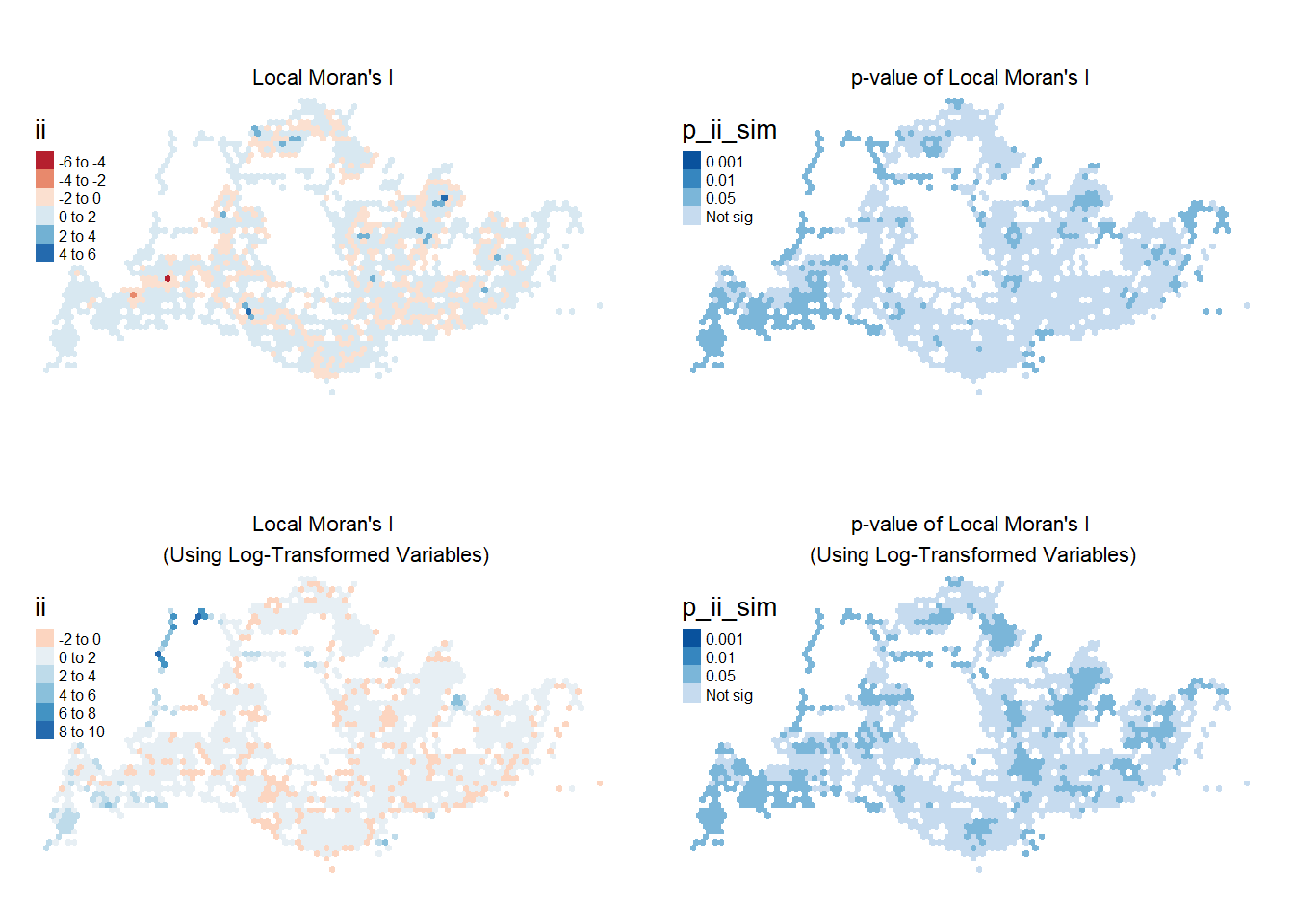
Show the code
tmap_mode("plot")
plot_lisaWDA <-
tm_shape(lisa_WDA) +
tm_fill("ii",
style="pretty",
palette="RdBu") +
tm_view(set.zoom.limits = c(6,8)) +
tm_layout(main.title = "Local Moran's I",
main.title.size = 0.7,
main.title.position = "center",
legend.title.size = 1,
legend.text.size = 0.5,
legend.position = c("left","top"),
frame = FALSE
)
plotp_lisaWDA <-
tm_shape(lisa_WDA) +
tm_fill("p_ii_sim",
breaks = c(0, 0.001, 0.01, 0.05, 1),
palette="-Blues",
labels = c(-Inf, "0.01", "0.05", "Not sig")) +
tm_view(set.zoom.limits = c(6,8)) +
tm_layout(main.title = "p-value of Local Moran's I",
main.title.size = 0.7,
main.title.position = "center",
legend.title.size = 1,
legend.text.size = 0.5,
legend.position = c("left","top"),
frame = FALSE
)
plot_lisalogWDA <-
tm_shape(lisa_logWDA) +
tm_fill("ii",
style="pretty",
palette="RdBu") +
tm_view(set.zoom.limits = c(6,8)) +
tm_layout(main.title = "Local Moran's I\n (Using Log-Transformed Variables)",
main.title.size = 0.7,
main.title.position = "center",
legend.title.size = 1,
legend.text.size = 0.5,
legend.position = c("left","top"),
frame = FALSE
)
plotp_lisalogWDA <-
tm_shape(lisa_logWDA) +
tm_fill("p_ii_sim",
breaks = c(0, 0.001, 0.01, 0.05, 1),
palette="-Blues",
labels = c("0.001", "0.01", "0.05", "Not sig")) +
tm_view(set.zoom.limits = c(6,8)) +
tm_layout(main.title = "p-value of Local Moran's I\n (Using Log-Transformed Variables)",
main.title.size = 0.7,
main.title.position = "center",
legend.title.size = 1,
legend.text.size = 0.5,
legend.position = c("left","top"),
frame = FALSE
)
tmap_arrange(plot_lisaWDA, plotp_lisaWDA, plot_lisalogWDA, plotp_lisalogWDA, asp=2, ncol=2)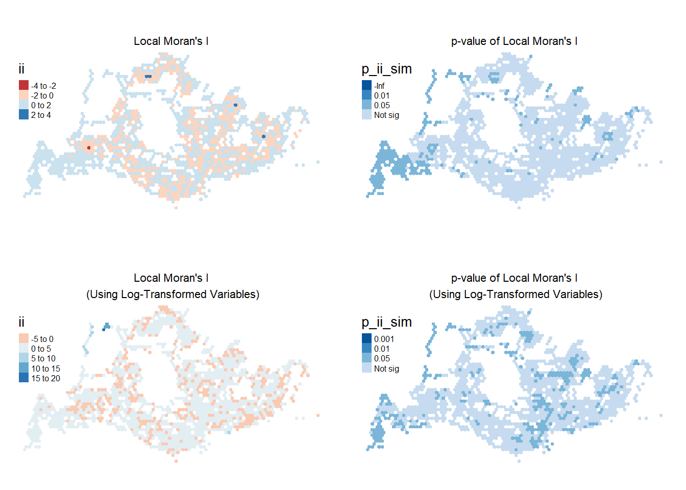
Show the code
tmap_mode("plot")
plot_lisaWEM <-
tm_shape(lisa_WEM) +
tm_fill("ii",
style="pretty",
palette="RdBu") +
tm_view(set.zoom.limits = c(6,8)) +
tm_layout(main.title = "Local Moran's I",
main.title.size = 0.7,
main.title.position = "center",
legend.title.size = 1,
legend.text.size = 0.5,
legend.position = c("left","top"),
frame = FALSE
)
plotp_lisaWEM <-
tm_shape(lisa_WEM) +
tm_fill("p_ii_sim",
breaks = c(0, 0.001, 0.01, 0.05, 1),
palette="-Blues",
labels = c(-Inf, "0.01", "0.05", "Not sig")) +
tm_view(set.zoom.limits = c(6,8)) +
tm_layout(main.title = "p-value of Local Moran's I",
main.title.size = 0.7,
main.title.position = "center",
legend.title.size = 1,
legend.text.size = 0.5,
legend.position = c("left","top"),
frame = FALSE
)
plot_lisalogWEM <-
tm_shape(lisa_logWEM) +
tm_fill("ii",
style="pretty",
palette="RdBu") +
tm_view(set.zoom.limits = c(6,8)) +
tm_layout(main.title = "Local Moran's I\n (Using Log-Transformed Variables)",
main.title.size = 0.7,
main.title.position = "center",
legend.title.size = 1,
legend.text.size = 0.5,
legend.position = c("left","top"),
frame = FALSE
)
plotp_lisalogWEM <-
tm_shape(lisa_logWEM) +
tm_fill("p_ii_sim",
breaks = c(0, 0.001, 0.01, 0.05, 1),
palette="-Blues",
labels = c("0.001", "0.01", "0.05", "Not sig")) +
tm_view(set.zoom.limits = c(6,8)) +
tm_layout(main.title = "p-value of Local Moran's I\n (Using Log-Transformed Variables)",
main.title.size = 0.7,
main.title.position = "center",
legend.title.size = 1,
legend.text.size = 0.5,
legend.position = c("left","top"),
frame = FALSE
)
tmap_arrange(plot_lisaWEM, plotp_lisaWEM, plot_lisalogWEM, plotp_lisalogWEM, asp=2, ncol=2, nrow = 2)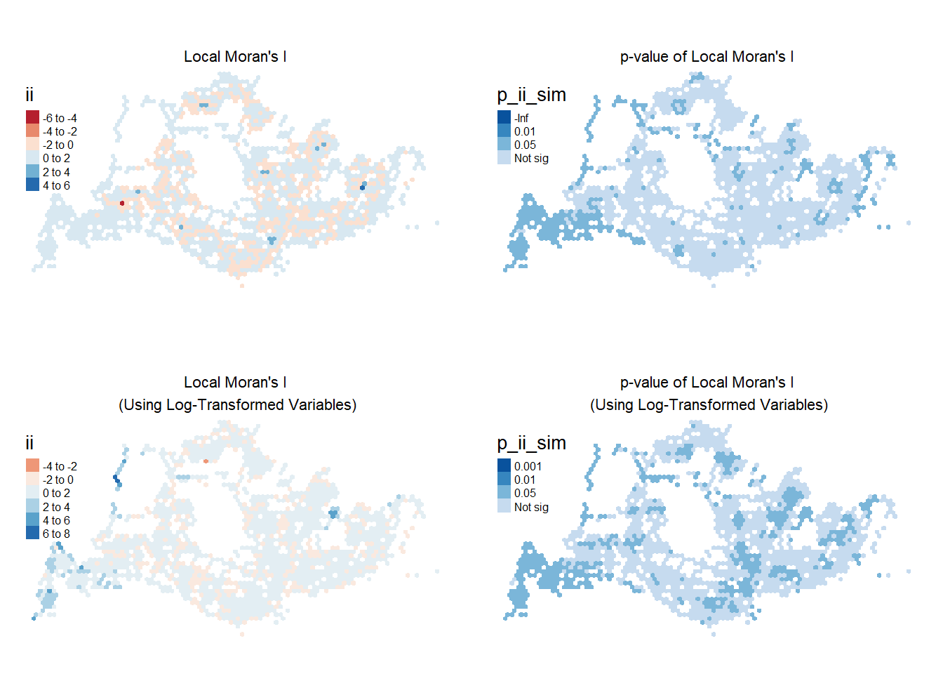
Show the code
tmap_mode("plot")
plot_lisaWEE <-
tm_shape(lisa_WEE) +
tm_fill("ii",
style="pretty",
palette="RdBu") +
#tm_borders(alpha = 0.5) +
tm_view(set.zoom.limits = c(6,8)) +
tm_layout(main.title = "Local Moran's I",
main.title.size = 0.7,
main.title.position = "center",
legend.title.size = 1,
legend.text.size = 0.5,
legend.position = c("left","top"),
frame = FALSE)
plotp_lisaWEE <-
tm_shape(lisa_WEE) +
tm_fill("p_ii_sim",
breaks = c(0, 0.001, 0.01, 0.05, 1),
palette="-Blues",
labels = c(-Inf, "0.01", "0.05", "Not sig")) +
#tm_borders(alpha = 0.5) +
tm_view(set.zoom.limits = c(6,8)) +
tm_layout(main.title = "p-value of Local Moran's I",
main.title.size = 0.7,
main.title.position = "center",
legend.title.size = 1,
legend.text.size = 0.5,
legend.position = c("left","top"),
frame = FALSE)
plot_lisalogWEE <-
tm_shape(lisa_logWEE) +
tm_fill("ii",
style="pretty",
palette="RdBu") +
# tm_borders(alpha = 0.5) +
tm_view(set.zoom.limits = c(6,8)) +
tm_layout(main.title = "Local Moran's I\n (Using Log-Transformed Variables)",
main.title.size = 0.7,
main.title.position = "center",
legend.title.size = 1,
legend.text.size = 0.5,
legend.position = c("left","top"),
frame = FALSE
)
plotp_lisalogWEE <-
tm_shape(lisa_logWEE) +
tm_fill("p_ii_sim",
breaks = c(0, 0.001, 0.01, 0.05, 1),
palette="-Blues",
labels = c("0.001", "0.01", "0.05", "Not sig")) +
#tm_borders(alpha = 0.5) +
tm_view(set.zoom.limits = c(6,8)) +
tm_layout(main.title = "p-value of Local Moran's I\n (Using Log-Transformed Variables)",
main.title.size = 0.7,
main.title.position = "center",
legend.title.size = 1,
legend.text.size = 0.5,
legend.position = c("left","top"),
frame = FALSE
)
tmap_arrange(plot_lisaWEE, plotp_lisaWEE, plot_lisalogWEE, plotp_lisalogWEE, asp=2, ncol=2, nrow=2)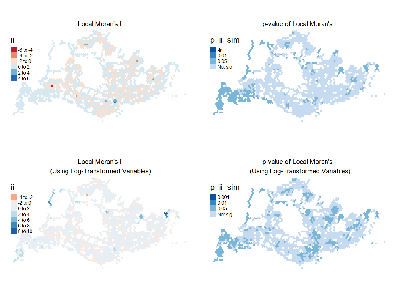
The plot on the top-left shows regions of positive (in blue) and negative (in red) Moran’s I statistics, indicating positive and negative clustering relationships. In particular, bus stops near transit hubs like Clementi Station, Tampines Interchange, and Punggol Station have high Local Moran’s I statistics across all four peak periods. On the contrary, Woodlands Checkpoint seems to only experience high Moran’s I on weekday mornings.
Notably, the Boon Lay MRT region displayed negative Local Moran’s (in red) throughout the four peak periods, indicating that the volume of passenger trips at this area is dissimilar to its neighbours.
On the top-right, we see that the p-values are significant at 5% significance level for the regions in the 3 darker shades of blue. We see that areas in the far West, North-West, and far East have statistically significant p-values for the cluster/outlier spatial relationship that they see.
We obtain different insights using the log-transformed variables to calculate Local Moran’s I. On weekdays, North-West region, particularly around Lim Chu Kang / Sungei Buloh. The plot on the right suggests that with p-value <0.05, the high spatial clustering observed in the area is also statistically significant.
LISA cluster maps combines both Local Moran’s I values and p-values to derive more insightful observations.
5.3.3 Visualising LISA Map
The LISA Cluster Map allows us to identify hotspots can its statistical significance. It is colour-coded by four types of spatial autocorrelation:
- High-High: Positive autocorrelation, i.e. clusters (indicates hexagon and its neighbours all have high ridership)
- Low-Low: Positive autocorrelation, i.e. clusters (indicates hexagon and its neighbours all have low number ridership)
- Low-High: Negative autocorrelation, i.e. outlier (indicates hexagon with low ridership among neighbours with high ridership)
- High-Low: Negative autocorrelation, i.e. outlier (indicates hexagon with high ridership among neighbours with low ridership)
The following functions are used:
filter() from dplyr used to retain records with statistically significant results (p-value < 0.05)
tmap_mode(“view”) allows for interactive viewing of plots
Note: The median is used for untransformed variables due to their right-skewed distribution, while the mean is used for log-transformed variables.
Weekday Morning
Show the code
lisa_sig_WDM <- lisa_WDM %>%
filter(p_ii_sim < 0.05)
tmap_mode("view")
tm_basemap("OpenStreetMap") +
tm_shape(lisa_WDM) +
tm_fill(alpha=0.6)+
tm_polygons() +
tm_shape(lisa_sig_WDM) +
tm_fill("median",
alpha=0.6,
id="LOC_DESC",
popup.vars = c("Location Description: " = "LOC_DESC",
"Grid ID: " = "grid_id",
"No. of Bus Stops:" = "busstops",
"No. of Passenger Trips :" = "WDM")) +
tm_borders(alpha = 0.4)Show the code
lisa_sig_logWDM <-lisa_logWDM %>%
filter(p_ii_sim < 0.05)
tmap_mode("view")
tm_basemap("OpenStreetMap") +
tm_shape(lisa_logWDM) +
tm_fill(alpha=0.6)+
tm_polygons() +
tm_shape(lisa_sig_logWDM) +
tm_fill("mean",
alpha=0.6,
id="LOC_DESC",
popup.vars = c("Location Description: " = "LOC_DESC",
"Grid ID: " = "grid_id",
"No. of Bus Stops:" = "busstops",
"No. of Passenger Trips :" = "WDM")) +
tm_borders(alpha = 0.4)The plot demonstrates that the statistically significant Moran’s I values are depicted in salmon for high-high autocorrelation and in teal for low-low autocorrelation, indicating clusters. Areas displaying low-low autocorrelation are primarily observed around the edges of the island, notably in the West, North-West, and East regions. In the context of our study, these areas experience low bus ridership and are surrounded by bus stops that also have low ridership. This pattern could suggest that on weekday mornings, these areas either have less human traffic or that residents prefer other forms of transportation. More and larger clusters are also seen using the log-transformed variables, where similar neighbouring hexagons demonstrate similar autocorrelation.
High-high autocorrelation areas, where both an area and its neighboring areas have high bus ridership, are scattered across the island. These are predominantly found near transit hubs such as Boon Lay Station, Aft. Bukit Panjang Station, Woodlands Checkpoint, and Buona Vista. Some residential estates and the neighourhood schools, including Punggol and Clementi, also exhibit high-high autocorrelation. This trend could be attributed to people traveling from their homes or switching transportation modes, opting for buses to reach their destinations. Retail centres appear to have high-high autocorrelation during the weekday morning peak-periods as well, evidenced in areas like Teck Whye Shopping Centre.
Several outliers are identified in purple and yellow. The Low-High regions (in purple) are generally found in proximity to high-high regions (in salmon). Conversely, High-Low regions (in yellow) appear to be located near low-low regions (in teal).
Weekday Afternoons
Show the code
lisa_sig_WDA <- lisa_WDA %>%
filter(p_ii_sim < 0.05)
tmap_mode("view")
tm_basemap("OpenStreetMap") +
tm_shape(lisa_WDA) +
tm_fill(alpha=0.6)+
tm_polygons() +
tm_shape(lisa_sig_WDA) +
tm_fill("median",
alpha=0.6,
id="LOC_DESC",
popup.vars = c("Location Description: " = "LOC_DESC",
"Grid ID: " = "grid_id",
"No. of Bus Stops:" = "busstops",
"No. of Passenger Trips :" = "WDA")) +
tm_borders(alpha = 0.4)Show the code
lisa_sig_logWDA <- lisa_logWDA %>%
filter(p_ii_sim < 0.05)
tmap_mode("view")
tm_basemap("OpenStreetMap") +
tm_shape(lisa_logWDA) +
tm_fill(alpha=0.6)+
tm_polygons() +
tm_shape(lisa_sig_logWDA) +
tm_fill("mean",
alpha=0.6,
id="LOC_DESC",
popup.vars = c("Location Description: " = "LOC_DESC",
"Grid ID: " = "grid_id",
"No. of Bus Stops:" = "busstops",
"No. of Passenger Trips :" = "WDA")) +
tm_borders(alpha = 0.4)For the weekday afternoon peak period, areas exhibiting high-high autocorrelation include transit hubs such as Opp. LakeSide Station, Bef. Khatib Station, Compassvale Station, Serangoon Station, Downtown Station, and others. This trend mirrors that of weekday mornings, where transit hubs experience high bus ridership, likely due to passengers switching between different modes of transportation.
Bus stop near area of attraction (like the Singapore Zoo) also showed high-low autocorrelation on weekday afternoons, compared to the high-high autocorrelation experienced on weekday morning peak period. This suggests that it’s ridership remains high but lower ridership recorded in the surrounding regions.
Using the log-transformed variable, the stretch along Orchard Road from Orchard Station to War Memorial Park, and CBD area in the South have also been highlighted as a high-high cluster.
During these afternoon peak periods, there appears to be less statistically significant autocorrelation, particularly in areas like the Loyang region, including Changi Prison and Laguna National Country Club. Notably, using the untransformed values, the Woodlands Checkpoint area does not demonstrate the statistically significant high-high relationship expected from the previous Section 4.2.2 Geovisualisation or in comparison to weekday mornings. This observation might indicate that there is more human traffic moving from Malaysia to Singapore in the mornings, resulting in higher bus ridership originating from the checkpoints.
Weekend/Holidays Morning
Show the code
lisa_sig_WEM <- lisa_WEM %>%
filter(p_ii_sim < 0.05)
tmap_mode("view")
tm_basemap("OpenStreetMap") +
tm_shape(lisa_WEM) +
tm_fill(alpha=0.6)+
tm_polygons() +
tm_shape(lisa_sig_WEM) +
tm_fill("median",
alpha=0.6,
id="LOC_DESC",
popup.vars = c("Location Description: " = "LOC_DESC",
"Grid ID: " = "grid_id",
"No. of Bus Stops:" = "busstops",
"No. of Passenger Trips :" = "WEM")) +
tm_borders(alpha = 0.4)Show the code
lisa_sig_logWEM <- lisa_logWEM %>%
filter(p_ii_sim < 0.05)
tmap_mode("view")
tm_basemap("OpenStreetMap") +
tm_shape(lisa_logWEM) +
tm_fill(alpha=0.6)+
tm_polygons() +
tm_shape(lisa_sig_logWEM) +
tm_fill("mean",
alpha=0.6,
id="LOC_DESC",
popup.vars = c("Location Description: " = "LOC_DESC",
"Grid ID: " = "grid_id",
"No. of Bus Stops:" = "busstops",
"No. of Passenger Trips :" = "WEM")) +
tm_borders(alpha = 0.4)There are a lot more low-low regions on weekend/holiday mornings, suggesting generally lower levels of ridership compared to the weekday peak periods. These clusters were noted along the peripheral edges. This is in line with the observations made in our barplot in Section 3.2.1. Another difference with the weekday peak periods is the low-low autocorrelation noted at the Science Park area evidenced by the cluster of teal hexagons in the South-West region.
There are also notably less high-high clusters in the West, specifically in the Jurong West / Boon Lay areas, and more of such clusters in the South-East region (i.e. Bras Basah and Marine Parade). There is also seemingly an influx of passengers from the Tanah Merah Ferry Terminal on weekend/holiday mornings, in contrast to the low-low autocorrelation for weekday-mornings.
Weekend/Holidays Evening
Show the code
lisa_sig_WEE <- lisa_WEE %>%
filter(p_ii_sim < 0.05)
tmap_mode("view")
tm_basemap("OpenStreetMap") +
tm_shape(lisa_WEE) +
tm_fill(alpha=0.6)+
tm_polygons() +
# tm_borders(alpha = 0.5) +
tm_shape(lisa_sig_WEE) +
tm_fill("median",
alpha=0.6,
id="LOC_DESC",
popup.vars = c("Location Description: " = "LOC_DESC",
"Grid ID: " = "grid_id",
"No. of Bus Stops:" = "busstops",
"No. of Passenger Trips :" = "WEE")) +
tm_borders(alpha = 0.4)Show the code
lisa_sig_logWEE <- lisa_logWEE %>%
filter(p_ii_sim < 0.05)
tmap_mode("view")
tm_basemap("OpenStreetMap") +
tm_shape(lisa_logWEE) +
tm_fill(alpha=0.6)+
tm_polygons() +
tm_shape(lisa_sig_logWEE) +
tm_fill("mean",
alpha=0.6,
id="LOC_DESC",
popup.vars = c("Location Description: " = "LOC_DESC",
"Grid ID: " = "grid_id",
"No. of Bus Stops:" = "busstops",
"No. of Passenger Trips :" = "WEE")) +
tm_borders(alpha = 0.4)Using the untransformed passenger volume, the bus stops in the West, North-West, and Changi Village regions continue to experience low ridership on weekday and holiday evenings, as illustrated by the clusters of teal hexagons. Bus stops located near transit hubs and around the shopping district in town exhibit high-high autocorrelation (in salmon). Notably, the area around Woodlands MRT station shows significant high-high autocorrelation, which could be attributed to its connectivity with Woodlands Bus Interchange and its status as an interchange serving both the North-South Line and the Thomson-East Coast Line. Interestingly, no high-low outliers (in yellow) are observed in the Central and South regions of Singapore.
More clusters are shown with the log-transformed passenger volume. In particular, Hougang Central, Paya Lebar / Joo Chiat region, Toa Payoh Central, Tiong Bahru and Clementi were not previously highlighted as high-high clusters before.
6 Conclusion
Our analysis of the originating bus stops of passenger trips has yielded several insights into statistically significant clusters and outliers based on the four peak hour periods. Overall, our analysis revealed clearly uneven distributions of bus ridership across Singapore. There is consistent high-high clusters around bus stops near transit hubs and residential neighborhoods across the four identified peak periods. In contrast, peripheral areas, predominantly composed of industrial estates, displayed low-low tendencies. Our analysis has also showed that variable transformation for a data with skewed distribution can deliver more in-dept results.
Future work can consider the following:
Our analysis has solely focused on originating bus stops. A more insightful analysis might emerge from considering the destinations, thus understanding the flow of passengers.
Given the clusters observed around bus stops near transit hubs, further analysis could be conducted in conjunction with data from other modes of public transportation.
It is also crucial to consider the population densities and socio-economic status of each region, as these factors might affect bus ridership compared to other modes of transport.
Exploring the connectivity of available buses at each bus stop might also yield interesting insights. For example, feeder buses within a neighborhood might be more widely used compared to buses traveling long distances to secluded areas with less demand.
7 References
epsg.io (2023). EPSG: 3414 SVY21 / Singapore TM. https://epsg.io/3414
ArcGIS Pro 3.2 (2023). How Cluster and Outlier Analysis (Anselin Local Moran’s I) works. https://pro.arcgis.com/en/pro-app/latest/tool-reference/spatial-statistics/h-how-cluster-and-outlier-analysis-anselin-local-m.htm